

The First Thing Your Guests Touch
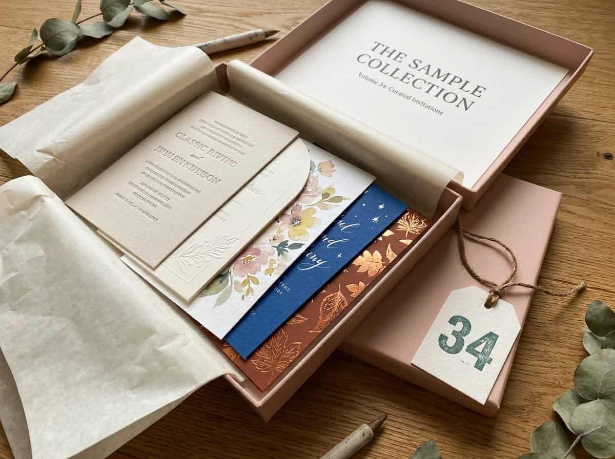
Before the venue, before the dress, before a single flower, your guests meet your wedding through an envelope. That’s why the invitation suite has become 2026’s quiet obsession: it sets the tone, signals the formality, and starts the anticipation, all in one opening. And this year’s stationery is genuinely exciting, sculptural die-cut shapes replacing the standard rectangle, painterly hand-illustrated florals, foil stacked with letterpress on a single card, vellum layers under wax seals, even plantable paper that grows wildflowers after the RSVP. I’ve gathered 34 wedding invitation ideas organized the way couples actually shop: by style, by season, and by budget, each with what defines it and an honest note. Somewhere in these envelopes is the first impression your wedding deserves.
How to Choose Your Suite
Three filters sort every option below. Style first: your invitation should preview the wedding, so a black-tie ballroom wants different paper than a barn or a beach, and the suite works hardest when it matches the day. Season second, because palettes, motifs, and even paper weight can echo the time of year, and seasonal alignment makes the whole suite feel intentional. Budget third, and honestly: order 9 to 12 months out for the most options, expect roughly 8 to 10 percent of the wedding budget for stationery if you want specialty printing, and know the two highest-impact low-cost upgrades are a colored envelope and a wax seal. Trends are the menu, not the rules, pick what sounds like you two.
Part 1: By Style
1. The Classic Calligraphy Suite
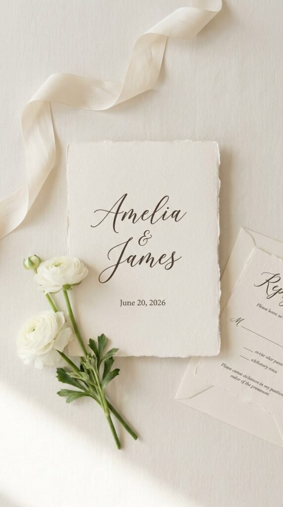
Timeless script names on heavy white or ecru stock, the invitation that never dates. It’s formality in its purest form. Pair traditional calligraphy with a modern sans-serif for details and the classic feels current.
2. The Modern Typography-Led Card
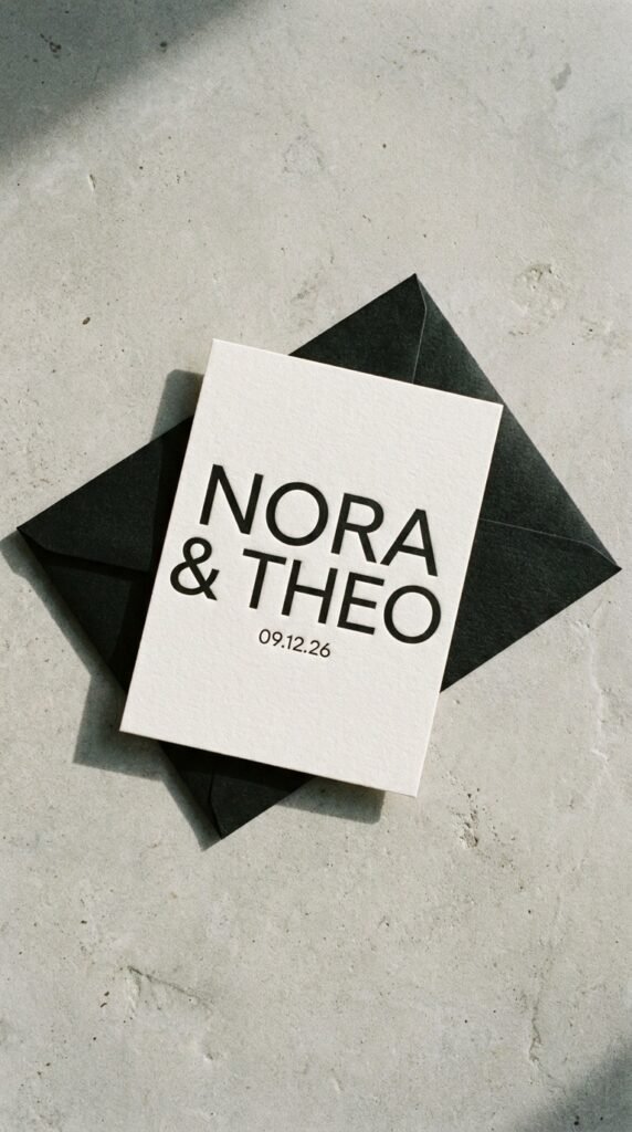
Clean layouts where the font itself is the design, oversized names, generous white space, nothing extra. It’s editorial confidence. Every element earns its place, which is exactly why it photographs so well.
3. The Arch Die-Cut
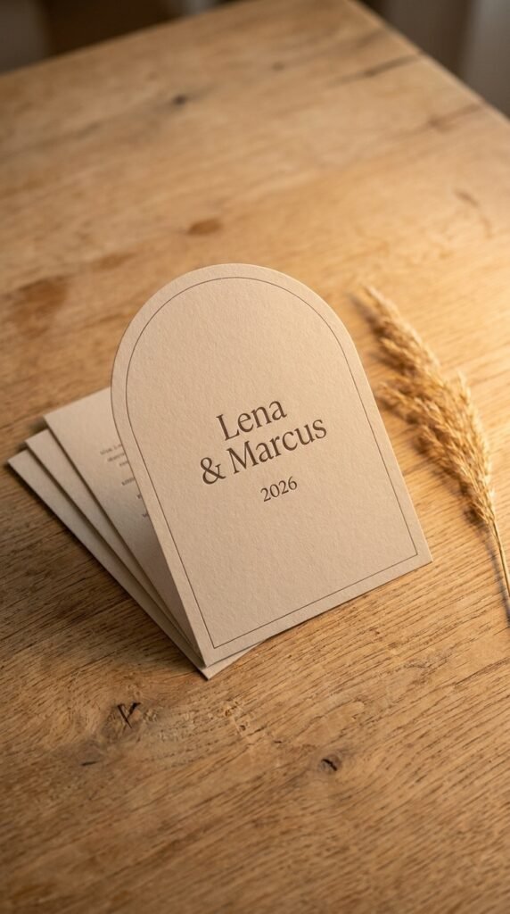
2026’s defining shape: an arched or soft-curved card that feels like an object, not a printout. The silhouette does the standing out. Pair a die-cut invite with straight-edge inserts for contrast.
4. The Scalloped Edge
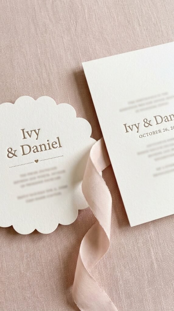
Scallops, waves, and ticket-style edges add movement and personality without adding clutter. It’s structure and softness at once. A scalloped save-the-date beside a clean invite is the styled combination.
5. The Painterly Floral
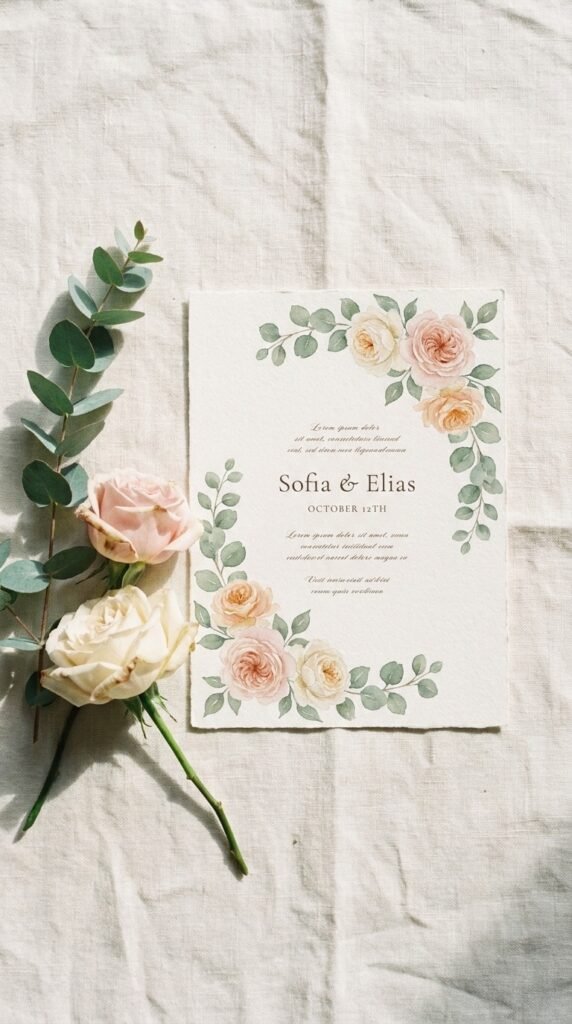
Hand-illustrated, commissioned-feeling florals have replaced flat clipart entirely, watercolor botanicals with organic movement. It’s romance with an artist’s touch. Match the blooms to your actual wedding flowers for full-circle magic.
6. The Foil-and-Letterpress Mix
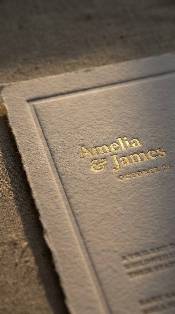
Mixed-method printing, flat foil shimmer plus deep letterpress impression on one card, is the luxury texture of 2026. It catches light and fingertips alike. One metallic, one ink color, and the card stays elegant.
7. The Vellum Layer
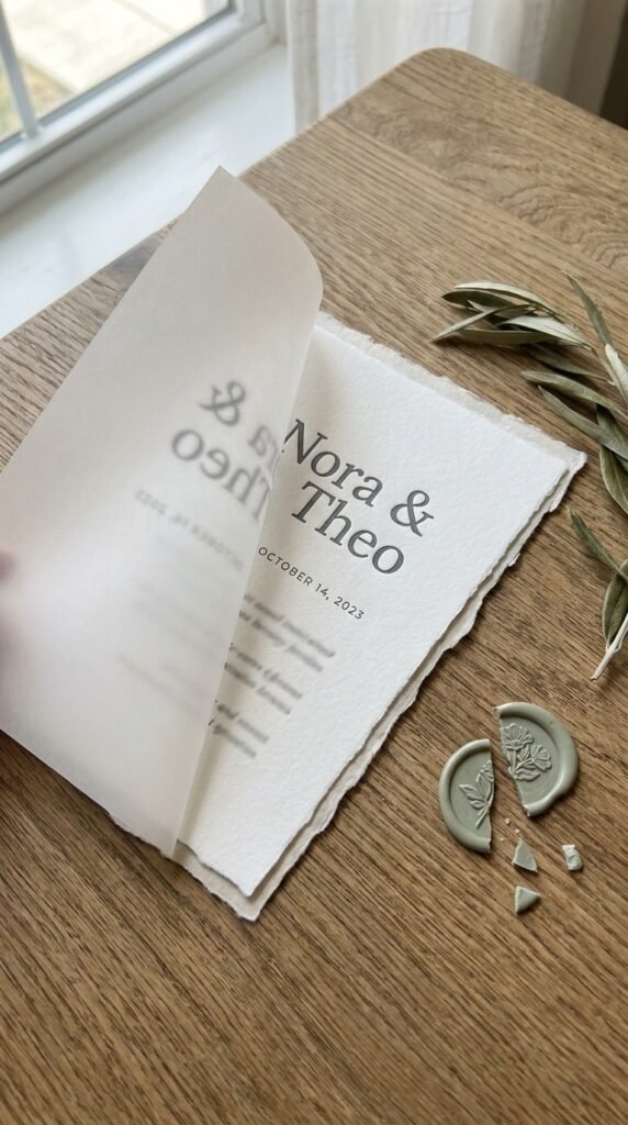
A translucent vellum overlay wrapped over the invite, often bound with a wax seal, turns opening the envelope into an unboxing. It’s dimension you can feel. The soft blur of type under vellum photographs beautifully.
8. The Wax-Seal Statement
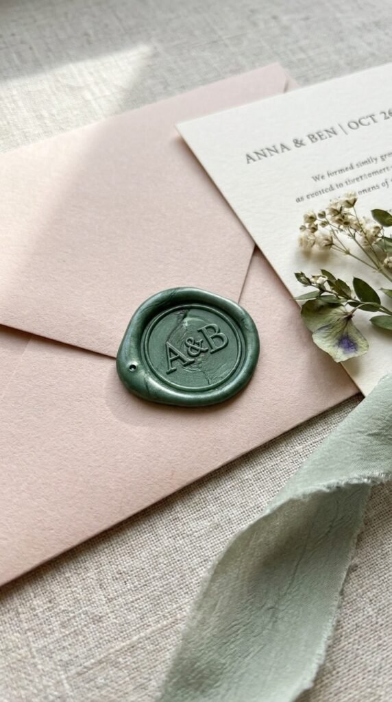
A wax seal with your monogram closes the suite with ceremony, and it’s among the cheapest luxury signals there is. It’s tactile heritage. Choose a seal color from your palette and it ties the whole suite.
9. The Scribble-Line Whimsy
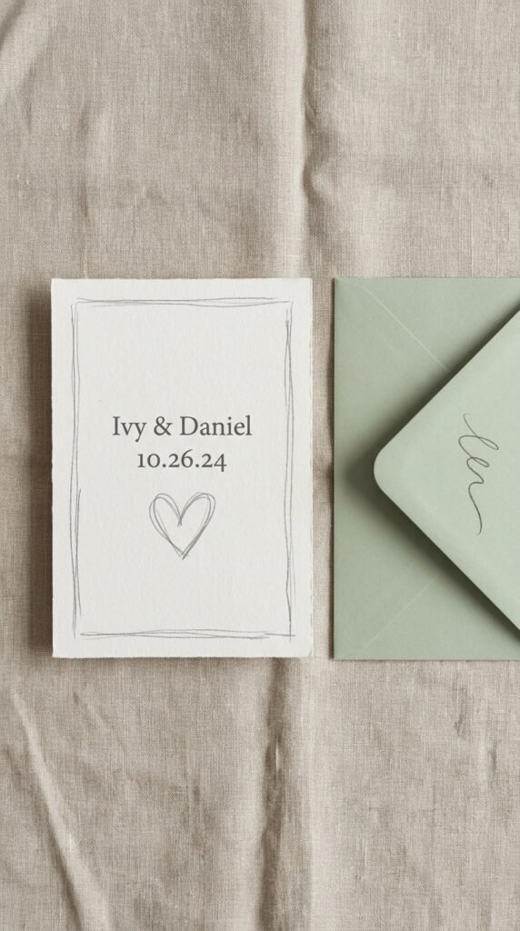
Expressive sketchbook linework, loose hearts, hand-drawn frames, brings a light, personal charm. It’s elegant without trying hard. Muted pastels keep the whimsy refined rather than childlike.
10. The Lace-and-Crochet Motif
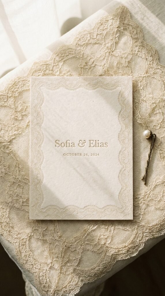
Lace-inspired patterns nod to gowns, veils, and heirlooms, texture and nostalgia in print. It’s inherently bridal. Tone-on-tone ecru lace on cream reads heirloom-modern.
11. The Bold Color-Block Modern
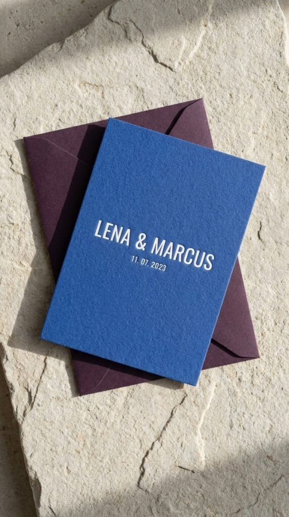
Saturated color, a cobalt card, an aubergine envelope, white ink on deep stock, for couples whose wedding won’t be beige. It’s confident and current. One bold hue plus one neutral keeps it designed, not loud.
12. The Illustrated Venue Portrait
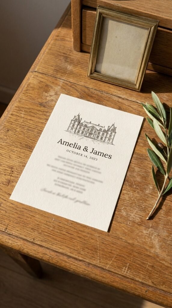
A custom sketch of your venue or city skyline makes the invitation a keepsake before the day even arrives. It’s your story, drawn. Guests frame these, which is the highest compliment stationery gets.
Part 2: By Season
13. Spring: The Garden Botanical
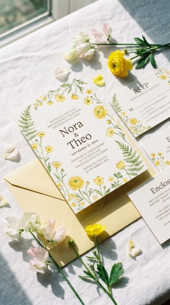
Soft watercolor greenery, blush and butter tones, wildflower borders, spring’s suite is a garden preview. It’s fresh and hopeful. Lighter paper and airy layouts echo the season’s ease.
14. Spring: The Plantable Eco Suite
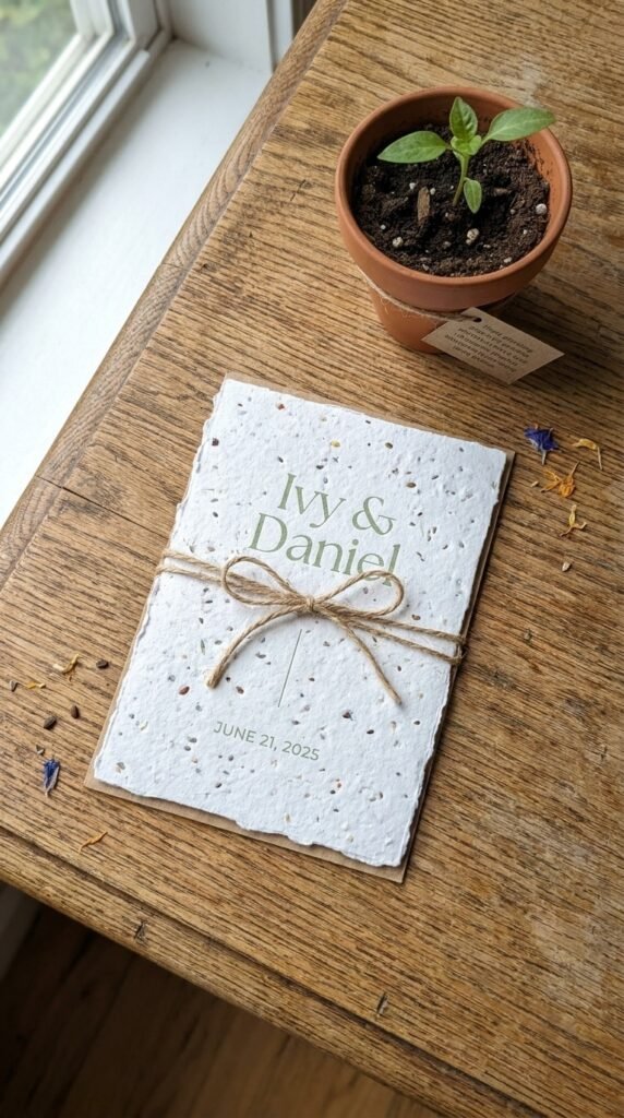
Seed-paper invitations guests literally plant after RSVPing, wildflowers from your wedding news. It’s the sustainable showstopper. Include a small ‘plant me’ note, it becomes the story guests retell.
15. Summer: The Citrus and Sun Palette
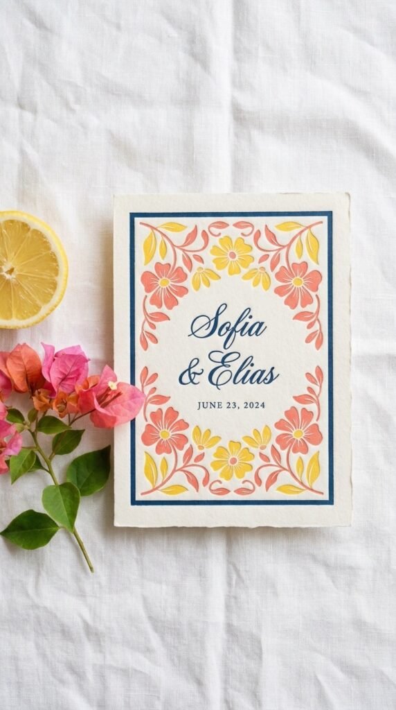
Warm corals, sunny yellows, and Mediterranean blues carry summer’s energy into the envelope. It’s vacation-wedding joy. Crisp white space keeps bright palettes elegant.
16. Summer: The Coastal Minimal
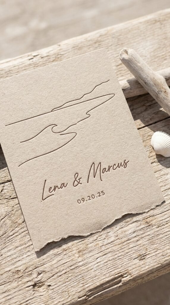
Sandy neutrals, a wave-cut edge or a single line-drawn shoreline, breezy typography. It’s beach formality done lightly. Pair with a linen-texture stock and the paper itself feels coastal.
17. Fall: The Terracotta and Copper Suite
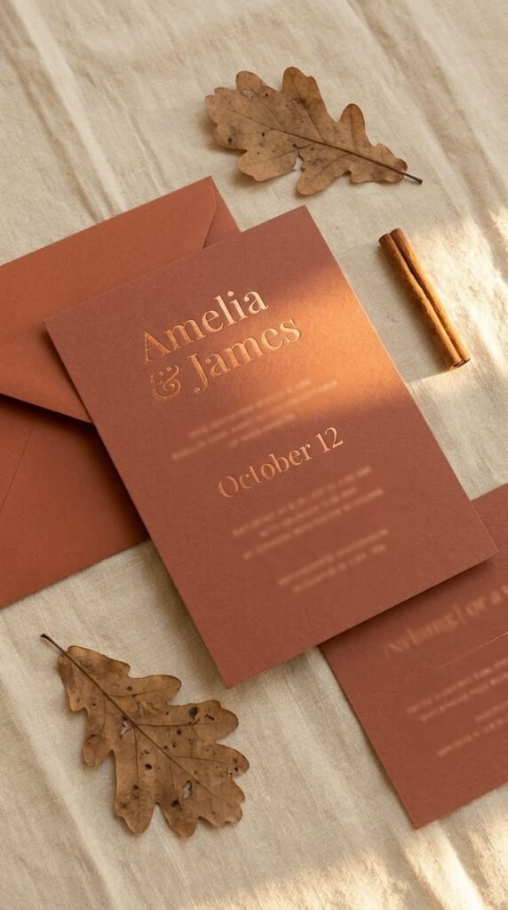
Rust, terracotta, and copper foil against warm cream, autumn’s palette in stationery form. It’s golden-hour on paper. Copper foil catches candlelight-toned photos beautifully.
18. Fall: The Moody Botanical
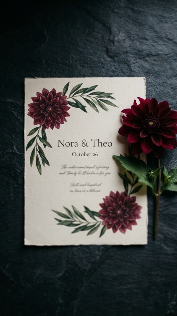
Deep burgundy blooms and olive greenery on ecru or slate, romantic with shadow. It’s the sophisticated harvest. Letterpress deepens the mood with real impression.
19. Winter: The Velvet-Touch Luxe
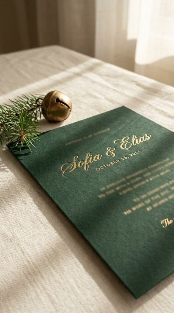
Soft-touch or velvet-laminate stock in deep green or navy with gold foil, winter formality you can feel. It’s cozy luxury. The matte-touch finish makes the foil sing by contrast.
20. Winter: The Frost and Silver Minimal
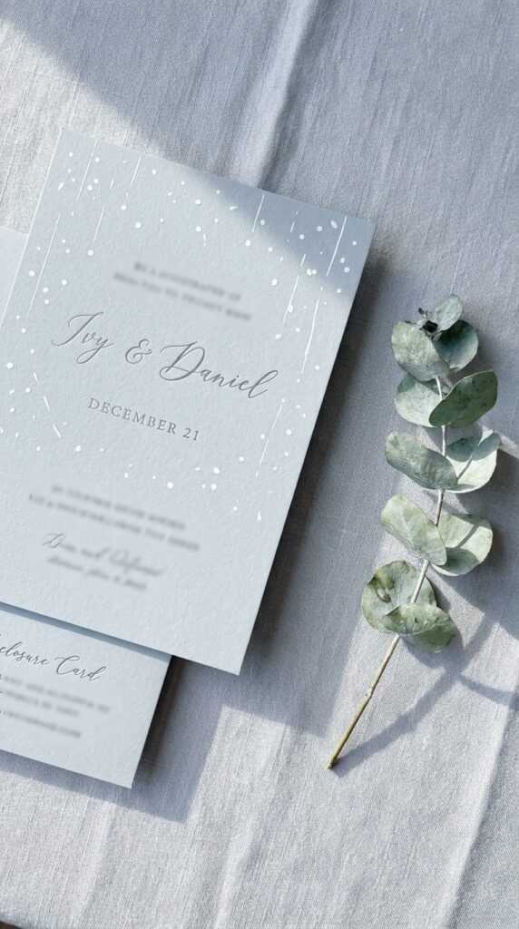
Icy blue-greys, silver ink, sparse snowlike white space, a quiet winter’s elegance. It’s crisp and calm. White ink on a colored stock is the modern frost effect.
21. The Festive Micro-Season Card
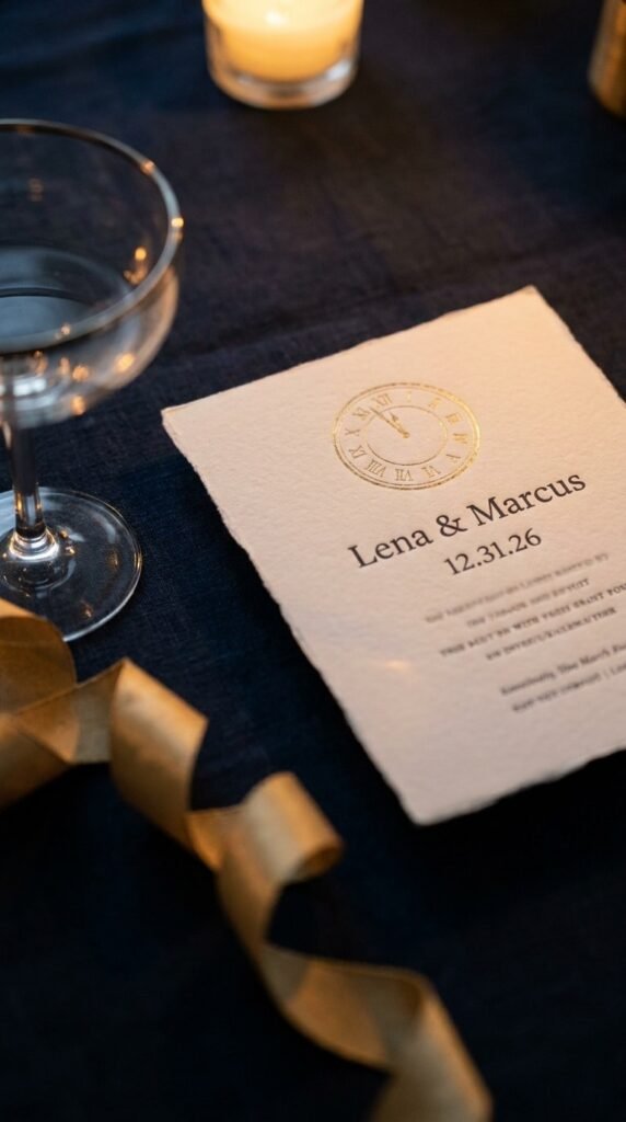
New Year’s Eve, Valentine’s, or holiday-weekend weddings earn a wink, a midnight-clock motif, a heart-sealed envelope. It’s dated in the best way. One thematic element only, the rest stays timeless.
22. The Season-Neutral Heirloom
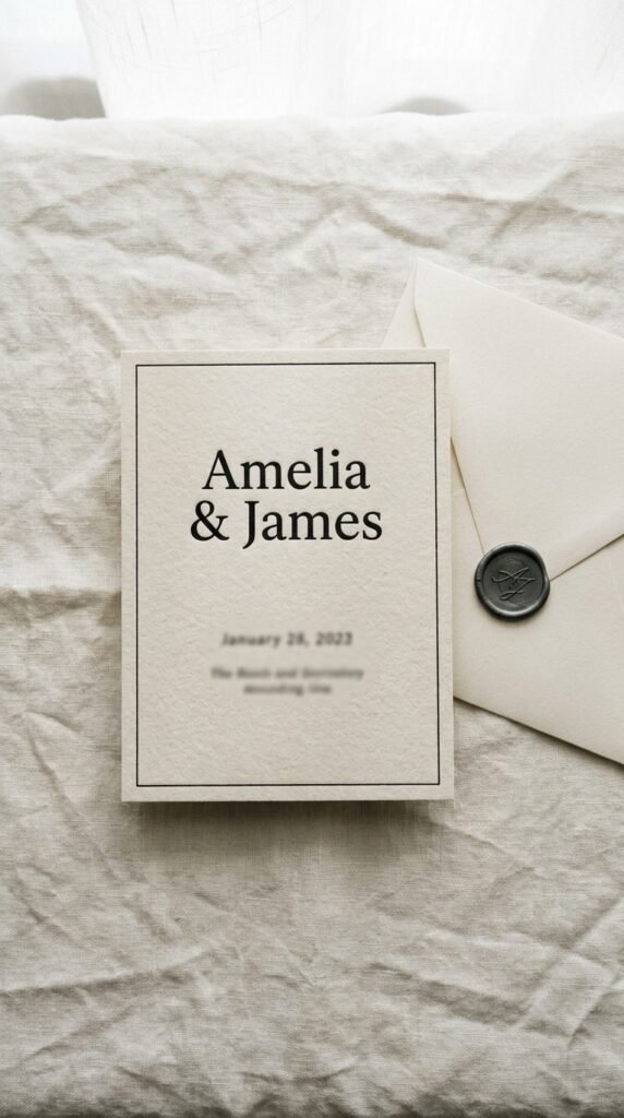
If you’d rather the suite outlive the season entirely: ecru, black ink, classic serif, heavy cotton. It’s the forever choice. This is the invitation that looks right in an album fifty years on.
Part 3: By Budget
23. Save: The Digital-First Invite
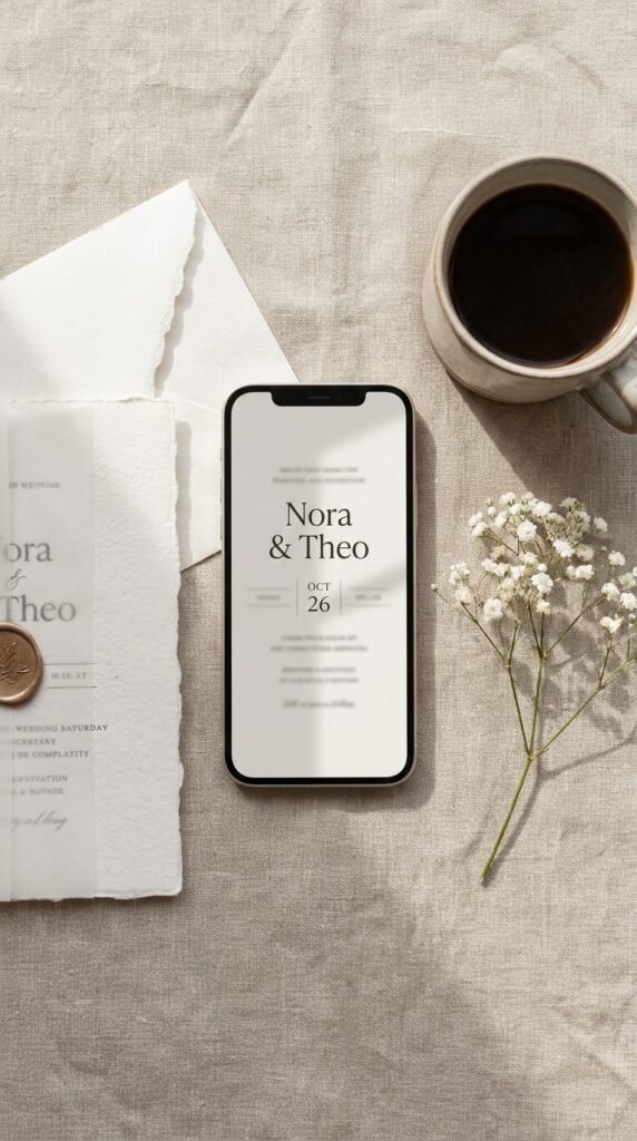
A beautifully designed digital invitation for casual or destination-coordination weddings costs almost nothing and arrives instantly. It’s the honest modern option. Reserve print for the formal core list if you want both worlds.
24. Save: The Printable Template
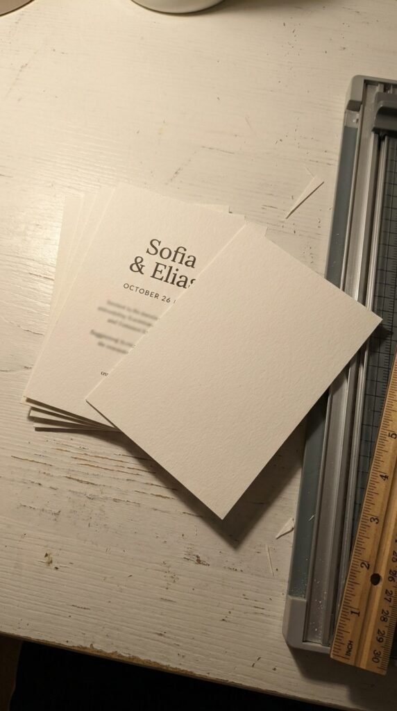
Editorial-quality templates you customize and print locally deliver the high-end look at craft prices. It’s DIY that doesn’t look DIY. Spend the savings on one upgrade, a wax seal or colored envelope.
25. Save: The All-in-One Folding Mailer
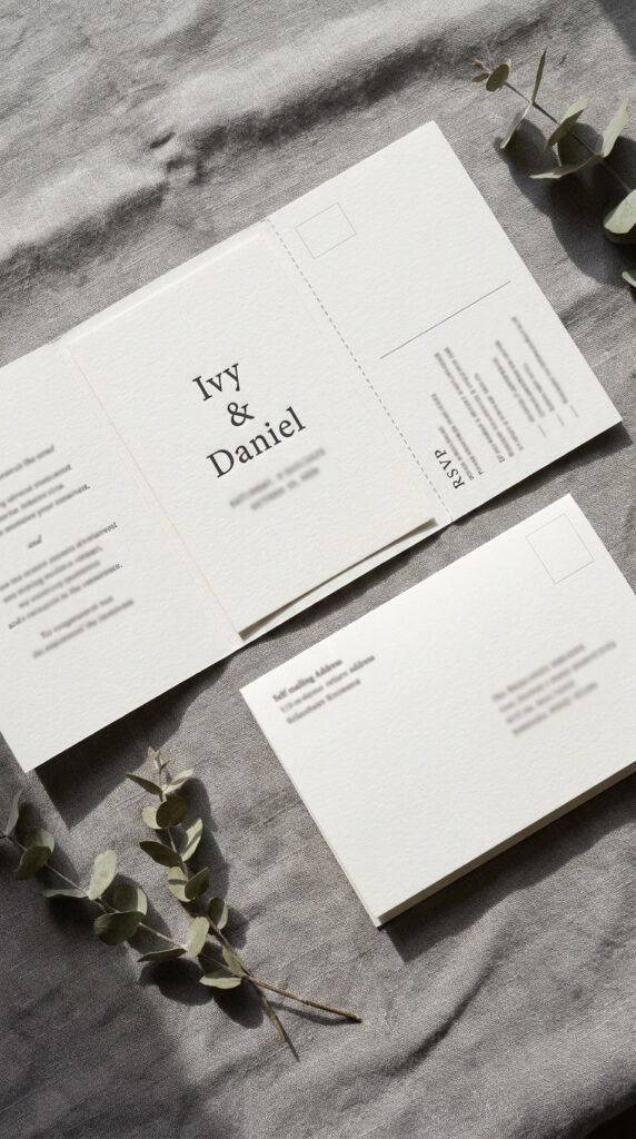
One self-mailing piece, invitation, details, and a perforated RSVP postcard, folded together. It’s the budget format of 2026. Fewer pieces, less postage, zero lost insert cards.
26. Save: The Colored-Envelope Upgrade
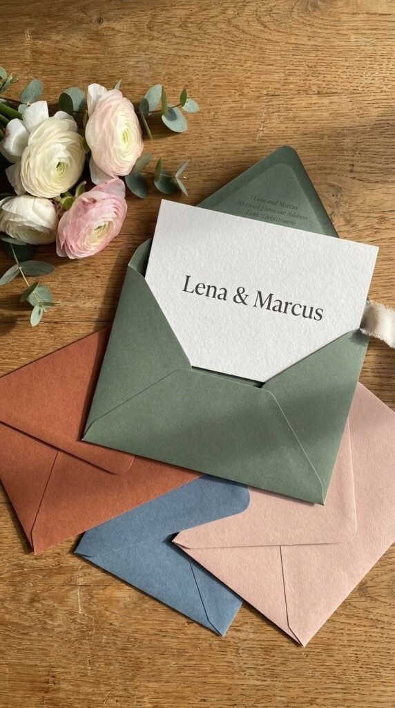
The single highest-impact low-cost move: a plain card inside a sage, terracotta, or dusty-blue envelope. The mailbox moment is the envelope. Add a printed return address and it looks fully custom.
27. Mid: The Semi-Custom Suite
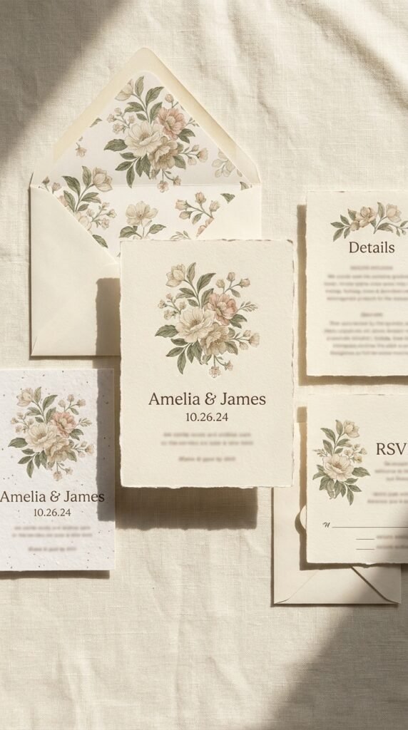
A designer’s existing suite with your names, palette, and wording, professional design without bespoke pricing. It’s the sweet spot most couples land on. Ask for the matching day-of pieces to keep the story cohesive.
28. Mid: The Single-Statement Foil
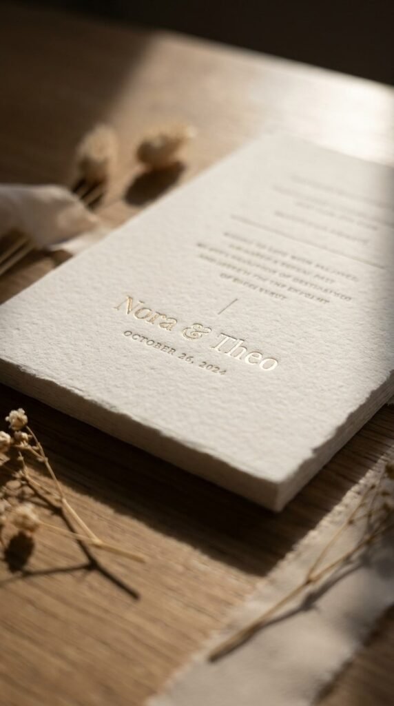
One foil element, just the names, or just a border, on an otherwise flat-printed card. It’s luxury in a measured dose. The restraint reads more expensive than foil-everything.
29. Mid: The Specialty-Stock Play
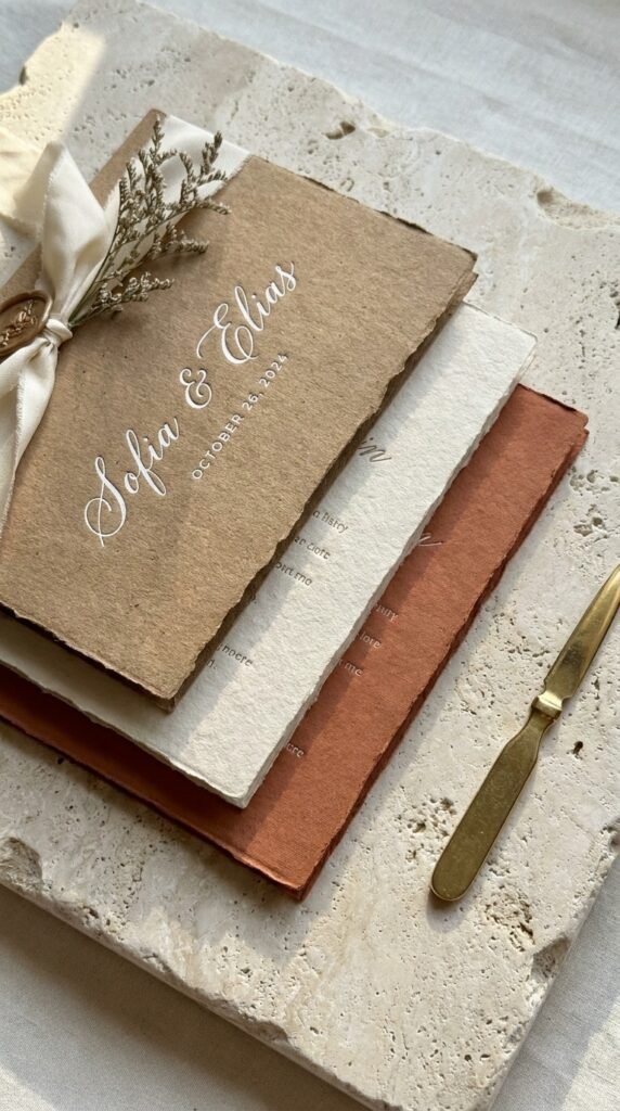
Let the paper be the design: thick cotton, kraft, linen texture, or a colored stock with white ink. The hand feels it before the eye reads it. Heavier stock plus simple design beats thin paper with heavy design.
30. Mid: The Vellum-and-Seal Combo
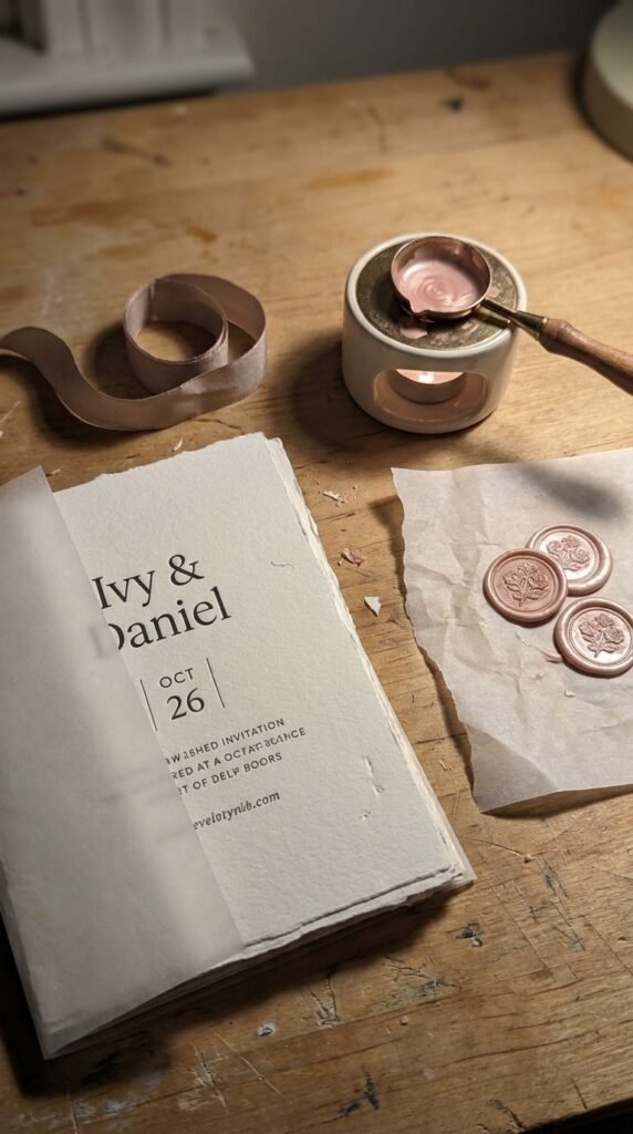
Vellum wrap, wax seal, one ribbon, layered tactility at a controlled cost. It’s the unboxing feel without bespoke numbers. Assemble them yourself over a weekend and save the assembly fee.
31. Splurge: The Full Letterpress Suite
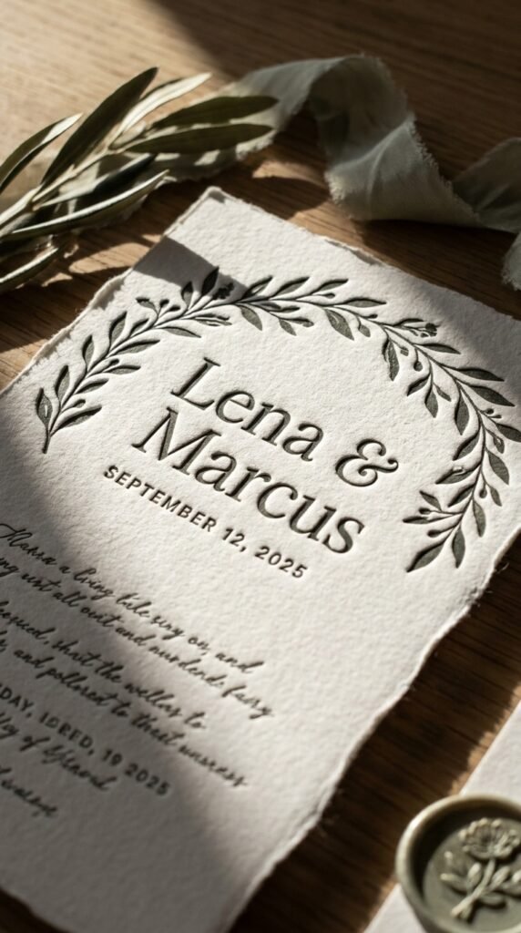
Deep letterpress on thick cotton across the whole suite, the tactile gold standard. It’s impression you can trace with a fingertip. Order early, the craft takes time and it’s worth every day.
32. Splurge: The Boxed Invitation Experience
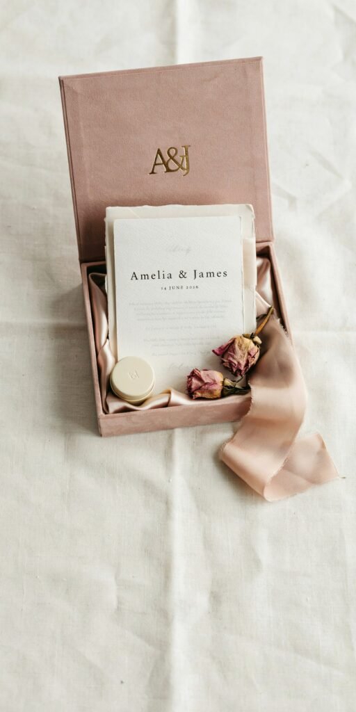
A rigid keepsake box with the layered suite, silk ribbon, florals or a favor inside, luxury unboxing as a category. It’s the couture of stationery. Reserve it for intimate lists where each box lands as a gift.
33. Splurge: The Acrylic or Specialty-Material Card
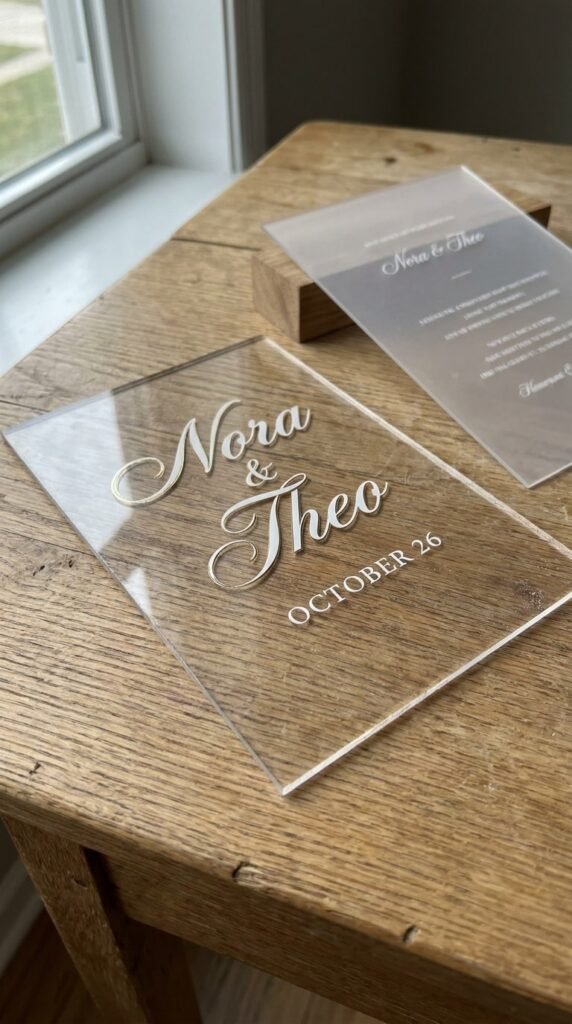
Invitations printed on clear acrylic, wood veneer, or silk, the material is the message. It’s unforgettable by design. Confirm postal requirements early, specialty materials often need hand-cancelling.
34. Splurge: The Fully Bespoke Commission
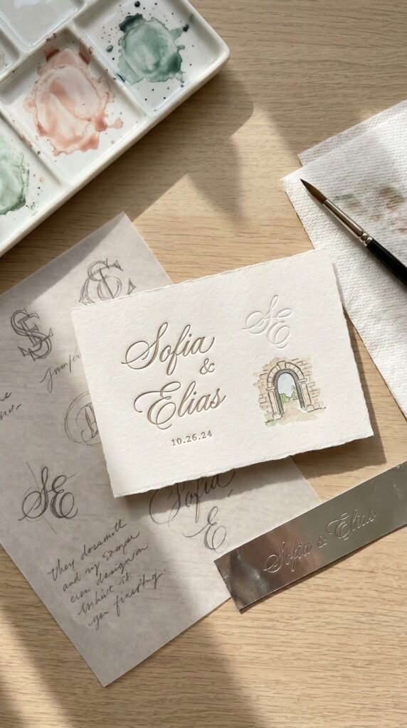
A stationer designs your suite from scratch, custom illustration, monogram, printing, envelopes, the works. It’s your wedding’s own brand. Bring your venue, palette, and story to the first meeting and let the artist translate.
How to Bring Your Suite Together
Decide the tone before the paper. Gather your venue photos, palette, and three words for the day, romantic, modern, wild, and every stationery decision downstream gets easier, because the suite’s only job is to preview those three words.
Spend where hands will notice. Guests feel weight, texture, and seals before they read a single line, so heavy stock, one tactile element, and a considered envelope outperform decorative extras every time. The colored envelope and wax seal remain the best value in the entire category.
And keep the story cohesive to the last detail. Carry the suite’s fonts, motifs, and palette into the day-of pieces, menus, programs, table numbers, so the first envelope and the final thank-you card feel like chapters of one book. That continuity is what guests remember as ‘the most beautiful wedding stationery,’ even if they never name why.
If I’m Picking Three to Start With
The arch die-cut for 2026’s defining shape, the semi-custom suite for the quality-to-budget sweet spot, and the colored-envelope upgrade because it improves literally any card inside it. Save this list to your wedding board on Pinterest before you meet any stationer, and send it to the newly engaged friend drowning in options, these three filters are the map.
