
Your Colors Tell the Whole Story
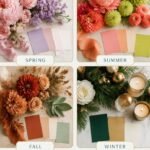
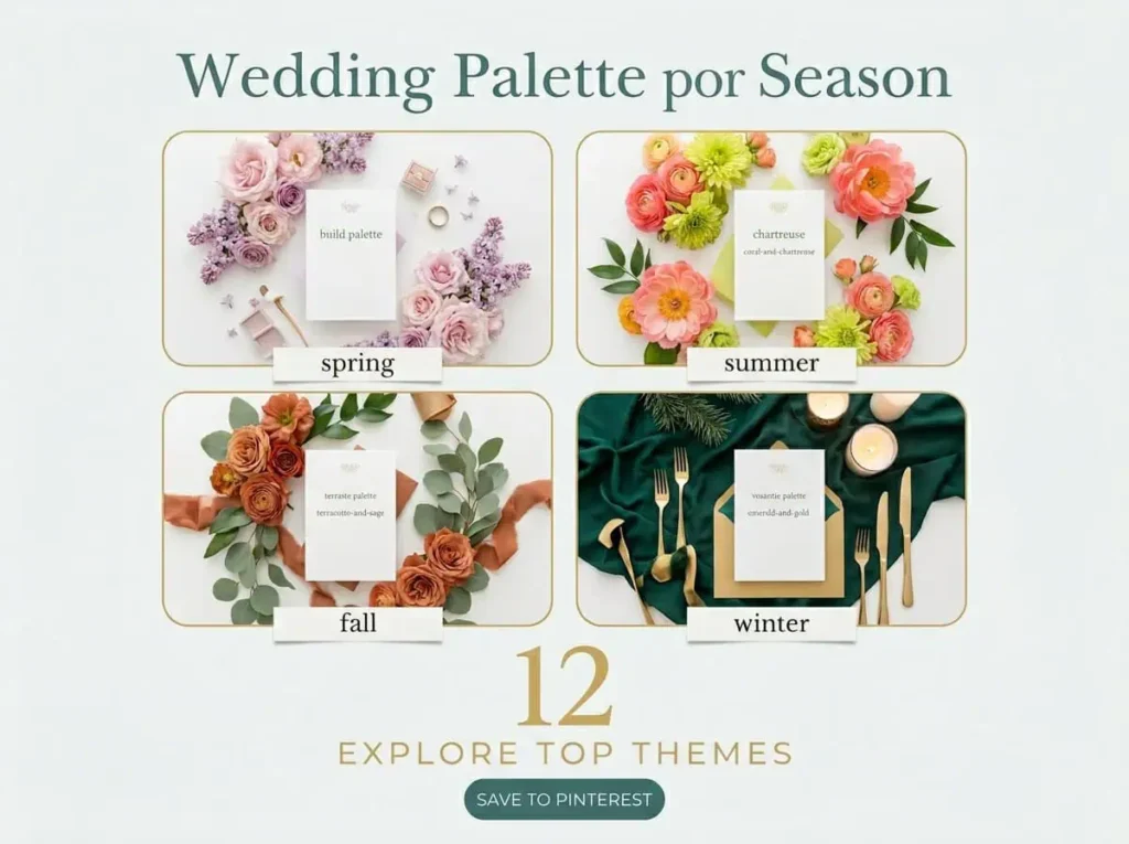
Few decisions set the mood of a wedding like the color palette. It runs from the first save-the-date through the florals, the bridesmaid dresses, the tablescape, the cake, and the tiny stationery details, and it quietly tells your story as a couple before a single vow is spoken. For 2026 the big shift is confidence: couples are moving past safe neutrals into layered, expressive combinations that still feel personal. I’ve organized 12 wedding color palette ideas by season, three for each, so whether you’re marrying under spring blossom or winter candlelight, there’s a palette here built for your light, your venue, and your day. One of these is the combination you’ll keep coming back to.
How to Build a Palette That Works
Before the palettes, one framework worth borrowing. The most successful 2026 weddings keep to three or four core colors, and planners suggest a simple recipe: one main color, one supporting color, one accent, one strong neutral, and one metallic. That gives you flexibility without chaos. The other trick is letting the palette evolve through the day, softer at the ceremony and bolder at the reception. And a note on shade: pick colors that genuinely resonate with you rather than a trend board, because the palette that reflects the couple always photographs more honestly than the one that chases a feed.
Spring Palettes: Soft, Fresh, and Romantic
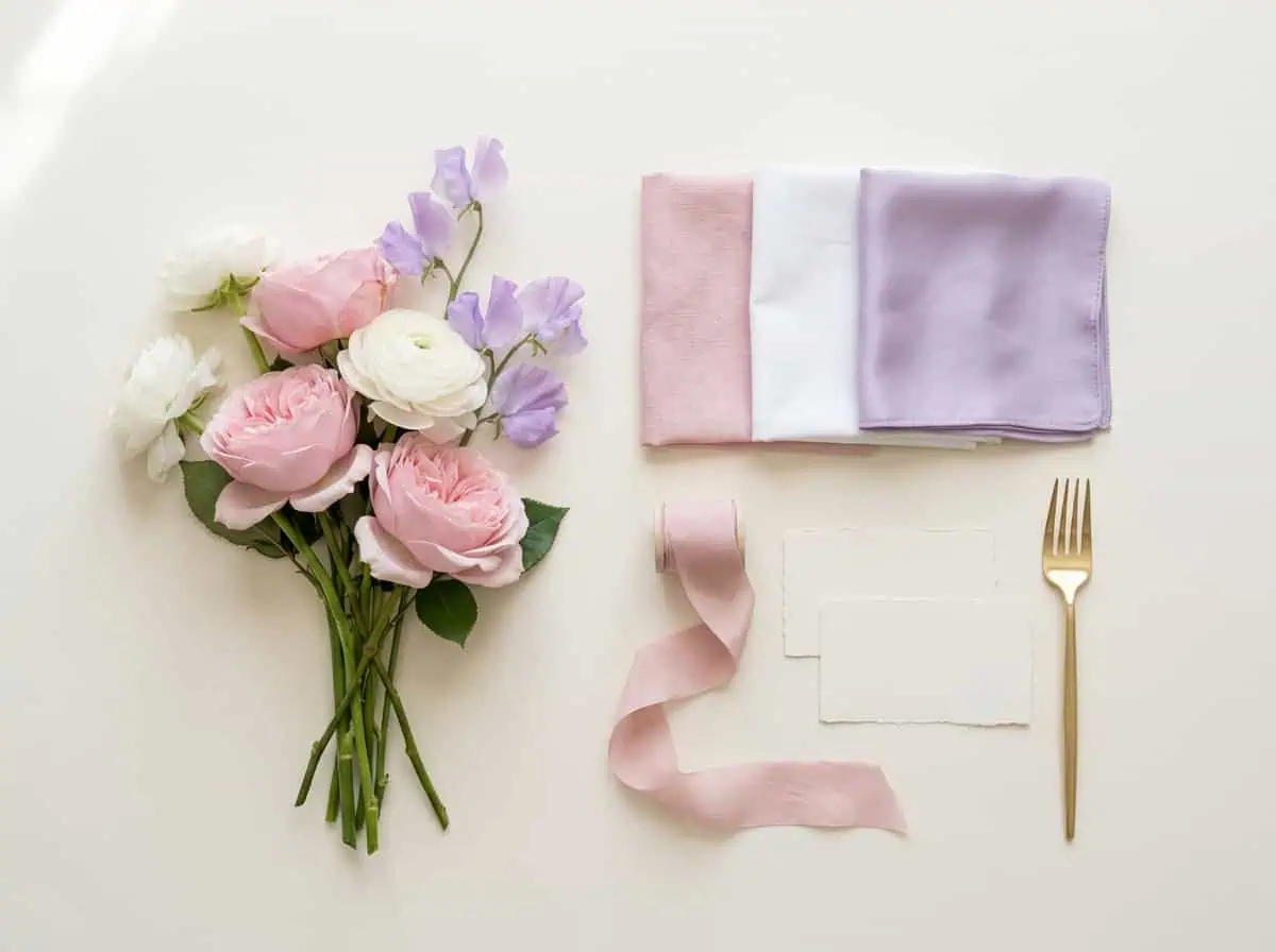
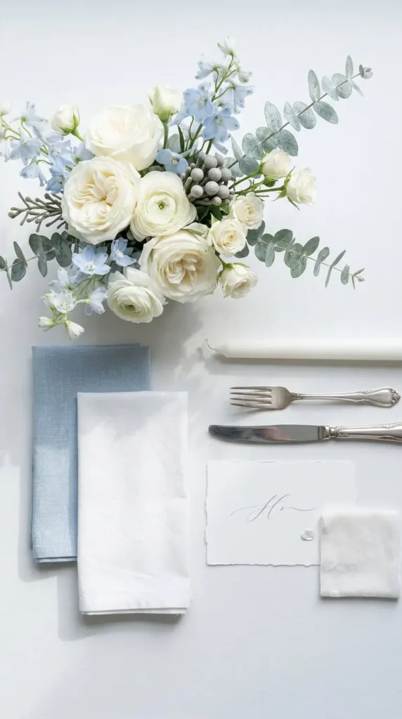
1. Soft Pink, White, and Lilac

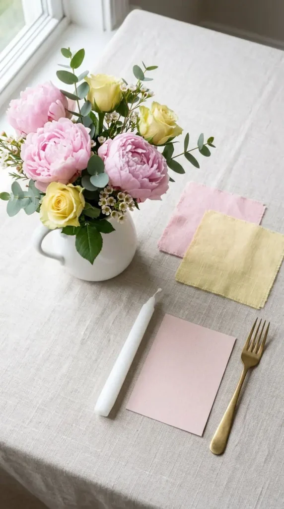
A gentle, ethereal blend where soft pink brings romance, white keeps it clean and classic, and lilac adds a whisper of whimsy. It’s the dreamy garden-and-fairytale palette, serene and enchanting without tipping into sweetness. Anchor it with plenty of white so the pastels read intentional, not washed out, and add a soft silver or pale gold metallic for lift.
2. Peach, Lavender, Warm Yellow, and Dusty Pink
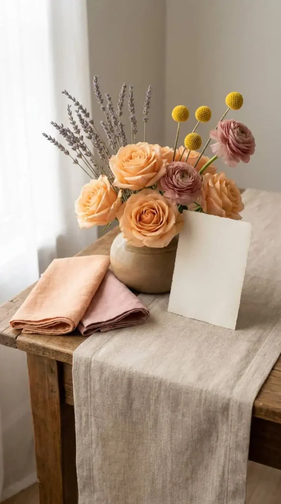
A sophisticated four-color spring story: soft peach and dusty pink for gentle warmth, lavender for elegance, and a warm yellow that infuses the whole thing with joy. It suits a romantic or vintage-themed celebration beautifully. The yellow is the one to use sparingly, as an accent in the florals or the cake rather than the linens, so it sparks rather than dominates.
3. Butter Yellow, Sage, and Cream
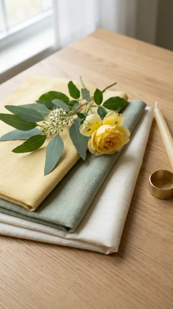
Yellow returns as the heartbeat of 2026 spring weddings, and the softest version pairs buttery yellow with muted sage and cream for something peaceful and uplifting at once. It’s fresh and modern without being loud. Sage does the grounding work here, so lean on greenery-heavy florals and let the butter yellow appear in candles, ribbon, and small stationery touches.
Summer Palettes: Joyful and Sun-Drenched
4. Tangerine and Cerulean
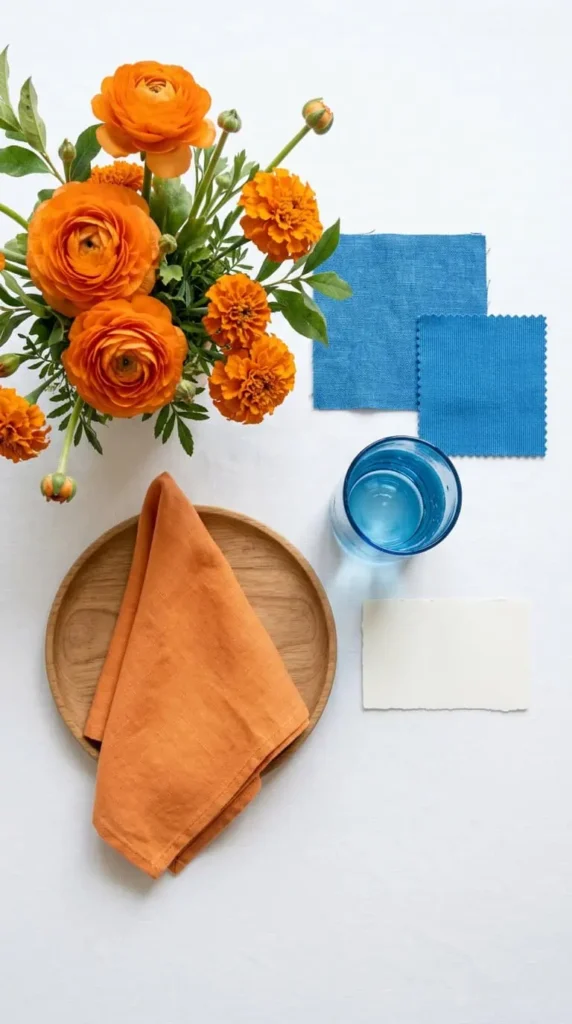
The boldest summer palette on the list: electric tangerine against bright cerulean blue, a high-energy contrast pulled straight from fashion and interiors. It’s expressive, joyful, and unforgettable, made for couples who want their day to feel like a celebration you can see from across the room. Keep the rest neutral, crisp white and natural wood, so the two brights stay the stars.
5. Butter Yellow, Strawberry, Coral, and Chartreuse
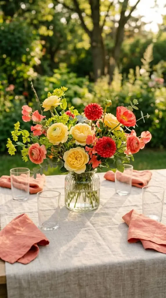
A sun-drenched, playful palette for outdoor summer celebrations: butter yellow, strawberry, coral, and a zing of chartreuse green. It’s joyful and a little unexpected, the kind of combination that photographs alive in golden-hour light. This one wants real flowers doing the heavy lifting, so build it around in-season blooms and let the tablescape stay simple underneath.
6. Cotton Candy and Lemon
Soft whimsy in pastel form: cotton-candy pink and pale lemon, the gentle, dreamy end of the summer spectrum. It’s romantic and lighthearted, lovely for a daytime garden reception. The risk with two pastels is that they go faint, so add a clear white and a touch of warm gold, and choose blooms with real saturation so the palette holds up in bright sun.
Fall Palettes: Warm, Rich, and Painterly
7. Peach, Soft Pink, Honey Gold, and Copper
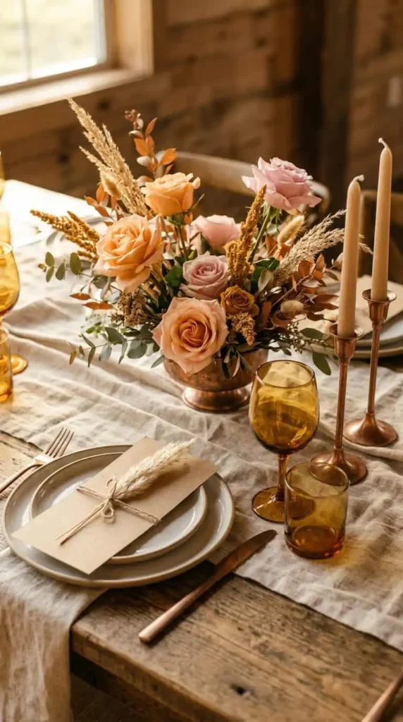
A late-summer-into-fall palette that brings warmth and depth without the usual autumn clichés. Peach and soft pink keep it bright, while honey gold and copper, pulled from turning foliage, ground it in the richness of the season. It’s the golden-hour palette, made for estate and vineyard venues where light and landscape do half the work. Earthy and elegant in equal measure.
8. Terracotta, Sage, and Cream
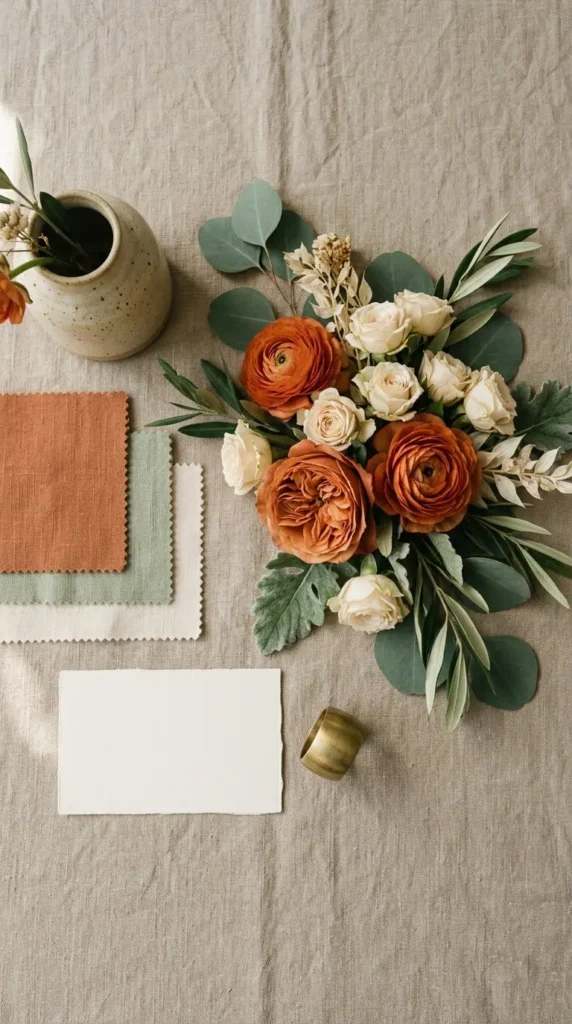
Terracotta is the versatile fall workhorse, warm and sophisticated, and paired with muted sage and cream it lands somewhere between rustic and refined. It suits an outdoor or barn celebration without feeling country, and it carries the 1970s-revival earth-tone mood that’s running through interiors right now. Bring it to life with textural linens and natural materials so the earthiness reads luxe, not plain.
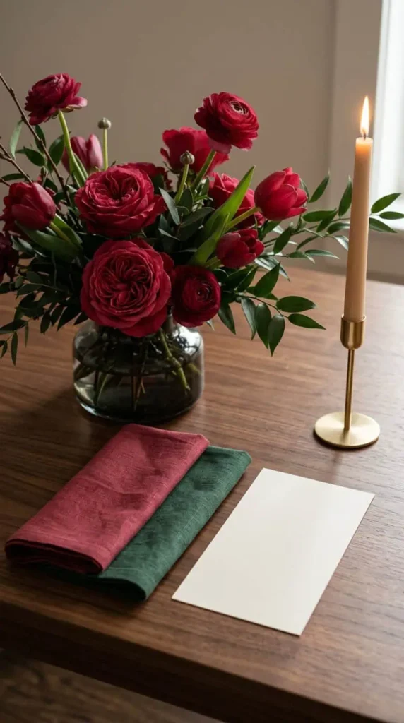
9. Burgundy and Dusty Rose
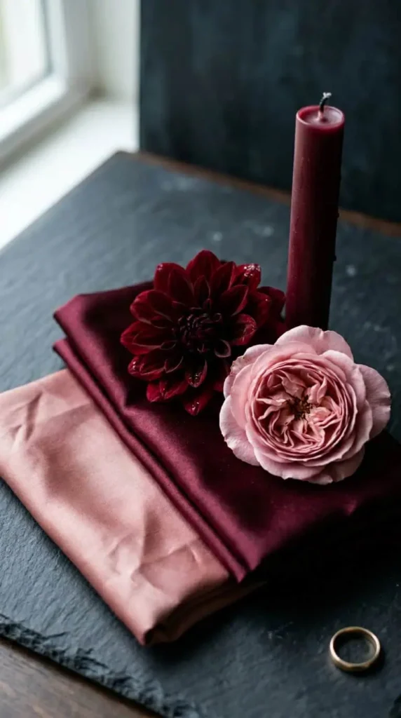
Deep reds and rich burgundy took over autumn weddings and aren’t going anywhere, and the modern way to wear burgundy is to soften it with dusty rose. The contrast keeps the deep shade from feeling heavy, luxurious but still romantic. For 2026, mismatched bridesmaid dresses in dusty pink and rosewood are a natural fit, letting the whole bridal party live inside the same warm family.
Winter Palettes: Jewel-Rich and Elegant
10. Emerald and Gold
Emerald sits at the very top of the 2026 forecast, and this is not sage or mint but rich, jewel-toned emerald that radiates sophistication and pairs beautifully with warm gold. It symbolizes growth and prosperity, which gives it meaning beyond looks, and it works across seasons but feels especially regal in winter candlelight. Gold is the metallic that makes it glow, so use it generously in the table settings.
11. Icy Blue, Silver, and White
The snowy-mountain palette: icy blue, cool silver, and crisp white for a winter-lodge or alpine celebration that feels clean and serene. It’s the cool-toned answer to all the warm fall reds, and it photographs crisp and luminous against snow or candlelight. Texture keeps it from feeling cold, so layer in velvet, faux fur, and plenty of candle warmth to soften the icy edge.
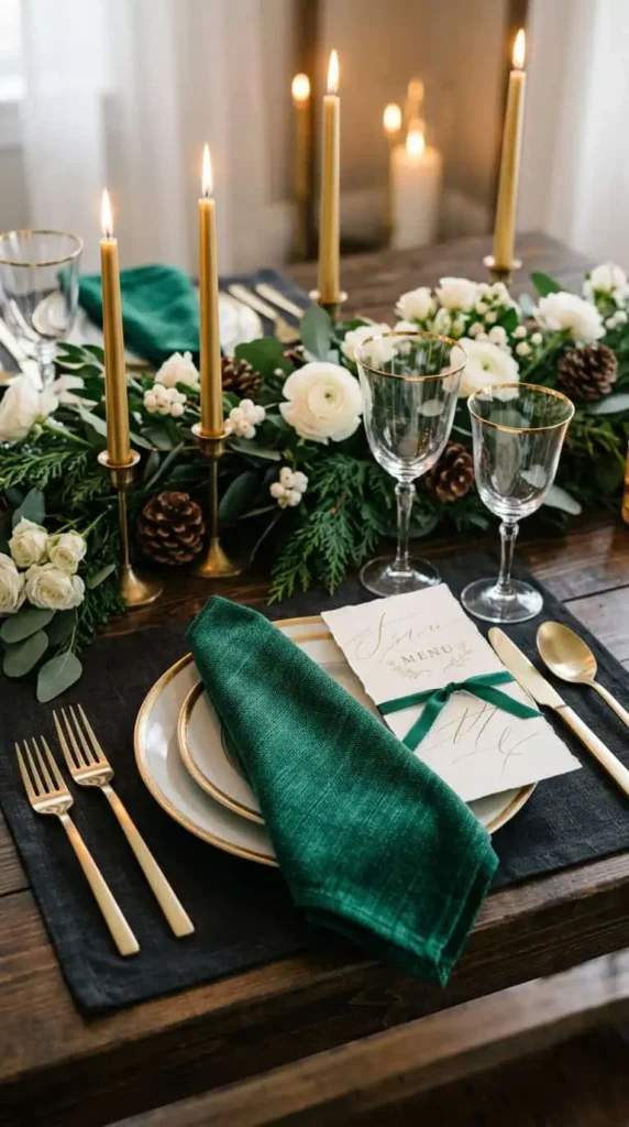
12. Berry Red and Hunter Green
Romantic berry red against deep hunter green is the festive winter classic done with restraint, rich and warm without reading like holiday decor. It’s elegant and unmistakably seasonal, gorgeous for a December celebration. The trick is choosing a true berry rather than a bright primary red, and grounding both in hunter green and plenty of candlelight so the palette feels luxe rather than literal.
How to Make Any Palette Look Expensive
Limit your core colors. Three to four is the sweet spot, and adding a fifth usually muddies rather than enriches. The cleanest palettes feel intentional precisely because they hold the line, letting texture and metallic, not extra colors, add the depth.
Let texture carry the richness. Especially with earth tones and jewel shades, luxe linens, velvet, candlelight, and natural materials do more for a palette than any additional hue. This is how moody and earthy colors read refined instead of flat, the same way they would in a beautifully designed room.
And match the palette to your light. Pastels and brights sing in summer daylight; jewel tones and deep reds come alive in autumn and winter candlelight; earthy neutrals love golden hour. Stand your swatches in the actual light of your venue and time of day before you commit, because color is only ever as good as the light it lives in.
If I’m Picking Three to Start With
Emerald and gold for the couple who wants timeless jewel-tone drama, terracotta and sage for the warm outdoor celebration, and soft pink with lilac for the romantic spring garden. Save this list to your wedding board on Pinterest before you meet your florist, and send it to the friend who’s been staring at color swatches for three weeks and can’t decide.