When you envision your wedding day, you might picture a setting that feels both serene and welcoming—one that reflects who you are and the special bond you share with your partner. Colors play a vital part in setting that mood. If you’re drawn to an ambiance that resonates with warmth and an organic look, exploring Earth Tone Wedding Color Ideas and Palettes can be the perfect place to begin. These hues, drawn from nature itself, tend to elevate your event with a calming, timeless vibe. They also blend seamlessly with various décor themes, from rustic woodland arrangements to more polished, contemporary receptions.
This guide takes you through 15 engaging palettes, each offering its own unique blend of complementary shades. You’ll also gain practical tips on bringing these colors to life, ensuring your celebration remains cohesive and unforgettable.

Think back to the last time you strolled through a lush garden at twilight or watched a gentle sunrise over rolling fields. Maybe there was a moment of stillness, a sense of grounded calm that made everything feel right in the world. When you use earth tone wedding colors, you’re attempting to replicate that sense of peace and wholeness. It’s a visual language that connects you, your partner, and your guests to the natural surroundings, welcoming everyone into a space of comfort and heartfelt celebration.
Perhaps you’ve imagined table linens in soft neutrals, centerpieces laden with fresh foliage, or bridesmaid dresses in a palette reminiscent of the sunset’s warm glow. Earth-inspired hues can help you craft an event that feels as though it’s always been part of the landscape. Your guests may even leave with fond memories of an environment that felt both nurturing and harmonious. After all, there’s something magical about a color scheme that mirrors the gentle tones of nature.
Why Choose Earth Tones for Your Wedding?
A Sense of Calm
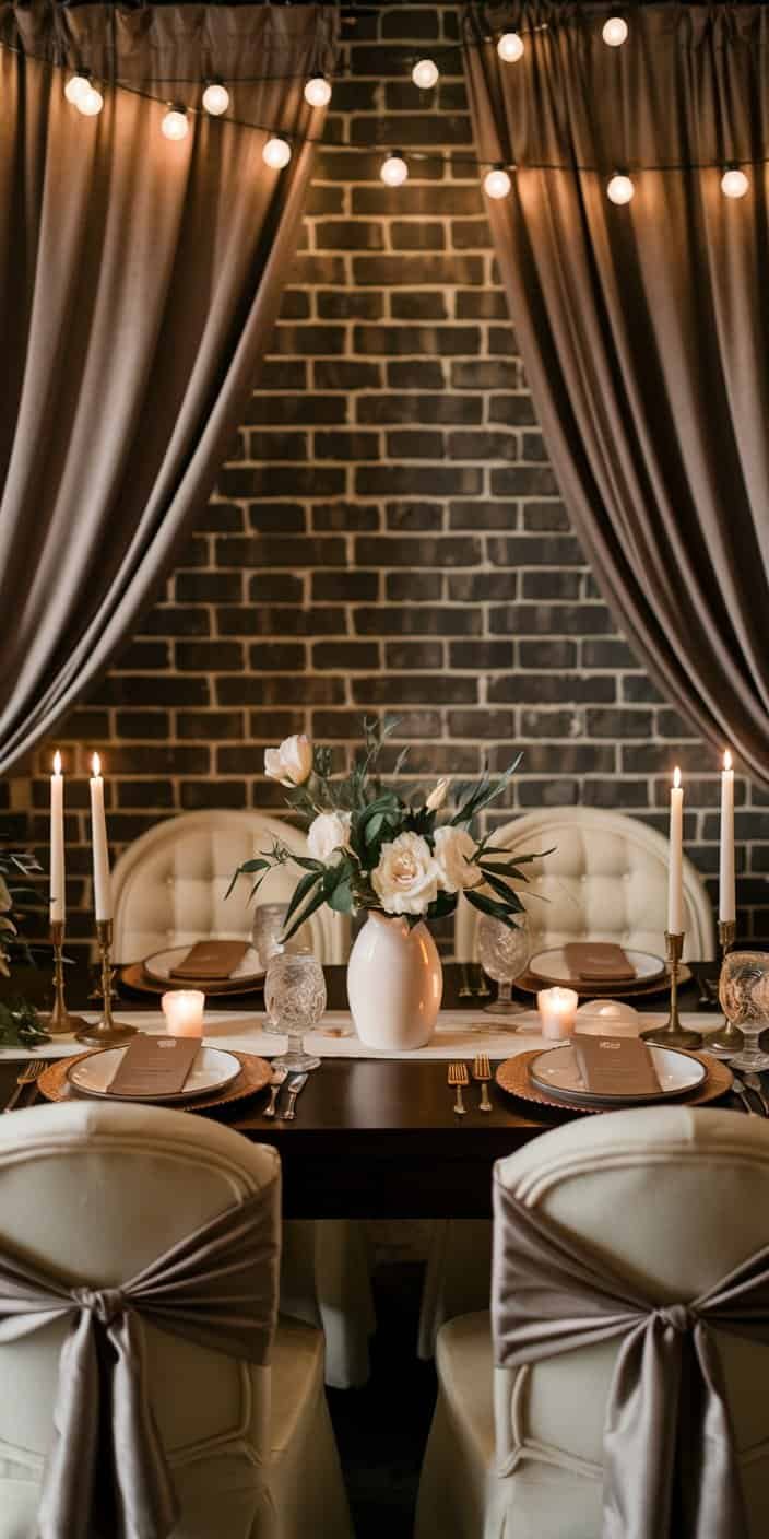
If you want your gathering to carry an undercurrent of tranquility, earth tones are especially fitting. Shades like sage green, taupe, or dusty rose often hold connotations of calmness and balance. In a setting where love and commitment take center stage, these colors can boost the emotional atmosphere by underscoring a sense of unity and support.
Timeless Appeal
There’s a reason these palettes never stray far from the wedding world’s radar. Neutral shades and organic tones often look just as stunning in photographs years later. While trendy bright hues may come and go, earth-inspired combinations tend to age gracefully, so you can flip through your wedding album a decade on and still appreciate the color story you chose.
Versatility Across Themes
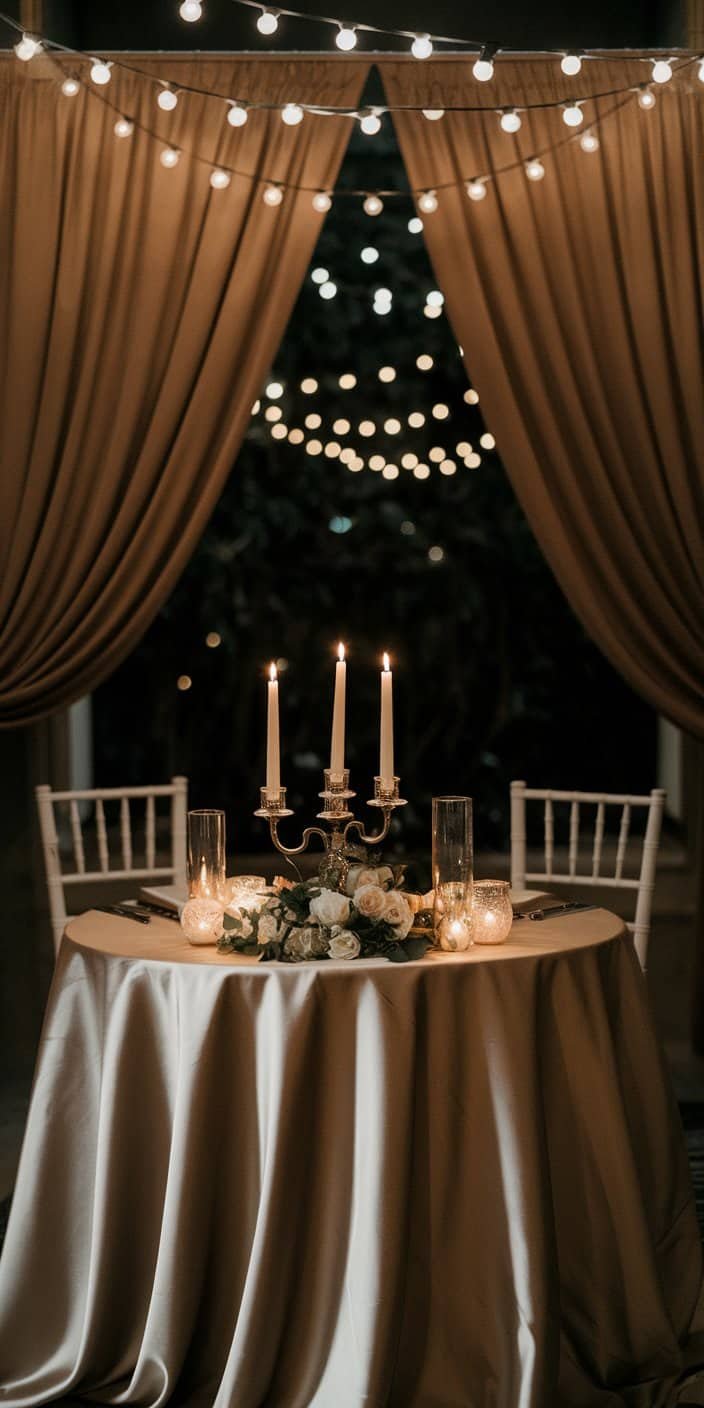
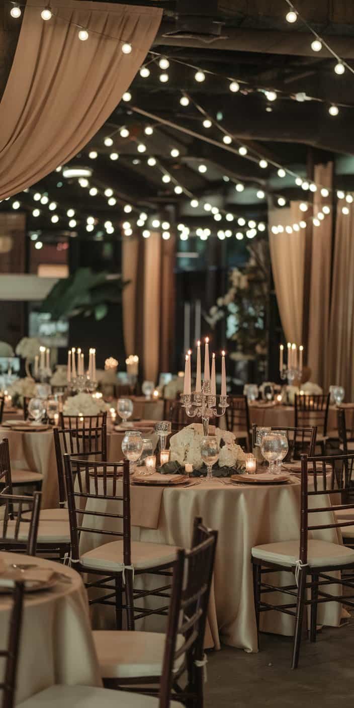
When you think about neutral shades, you might imagine rustic barns and outdoor soirees. Yet these hues also translate beautifully to industrial-chic loft spaces, grand ballrooms, or cozy backyard gatherings. By pairing subdued earth tones with subtle metallic accents or complementary pops of color, you’ll find the style possibilities nearly endless. That makes them an attractive option whether you’re aiming for minimalist elegance or a more bohemian flair.
Industry Insights
Professional wedding planners often emphasize how much couples enjoy customizing these colors. They can mix shades of green with neutrals for a laid-back garden fete or add deeper browns for a moody, candlelit event. In each scenario, you’ll see that nature’s palette weaves seamlessly into a wedding’s design elements—florals, table decor, and attire—bringing an underlying sense of cohesion to the celebration.
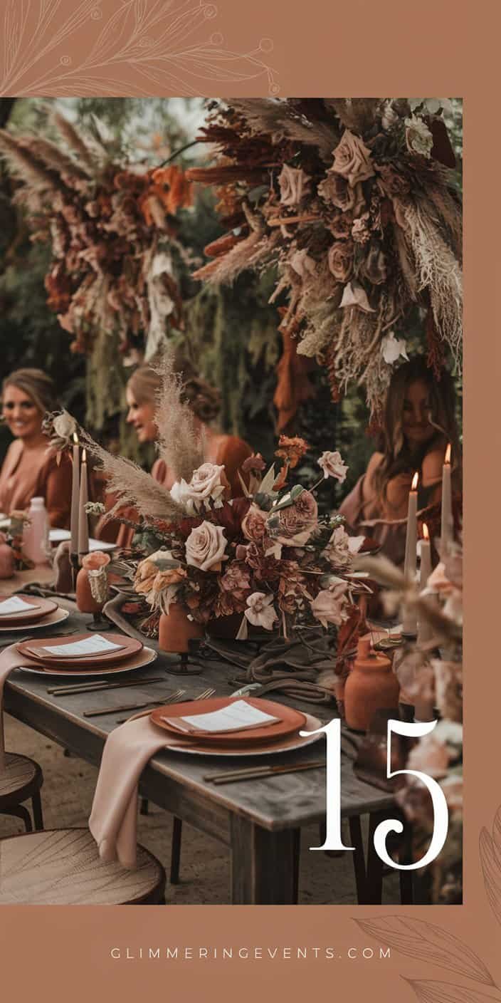
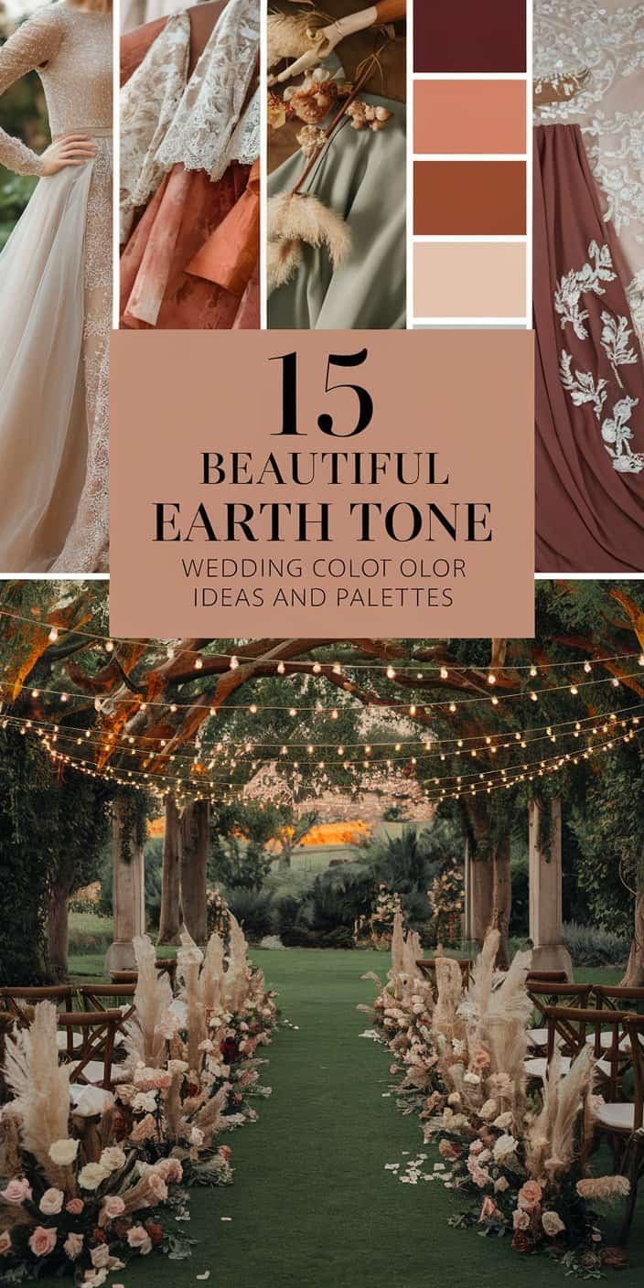
15 Earth Tone Wedding Color Ideas and Palettes
Below, you’ll find an array of pairings (and even a trio) that can help you shape an inviting wedding environment. From muted neutrals to bolder takes on earthy hues, each suggestion offers a distinct blend of textures, feelings, and seasonal possibilities.
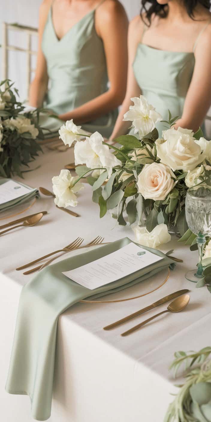
1. Sage Green and Ivory
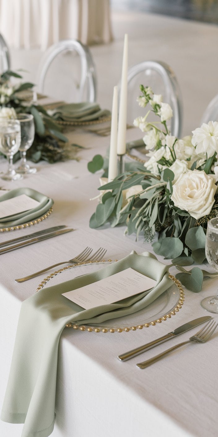
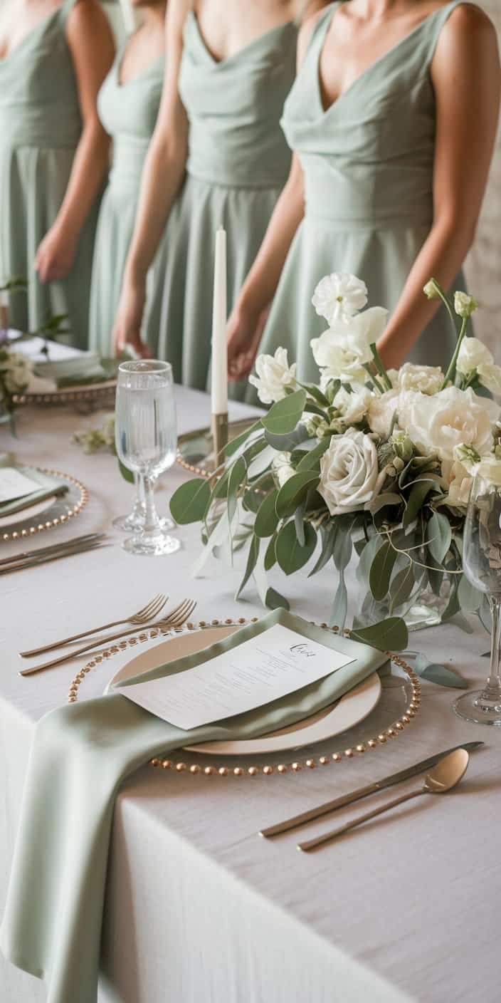
Sage and ivory combine for a refreshing, balanced look. Sage features a subdued green that coordinates effortlessly with ivory’s airy brightness. Picture your bridesmaids donning sage dresses with ivory bouquets, or tables decked out in ivory linens paired with sage-hued napkins. This combo is particularly fitting if you enjoy minimalism, as it projects a fresh, simple aesthetic.
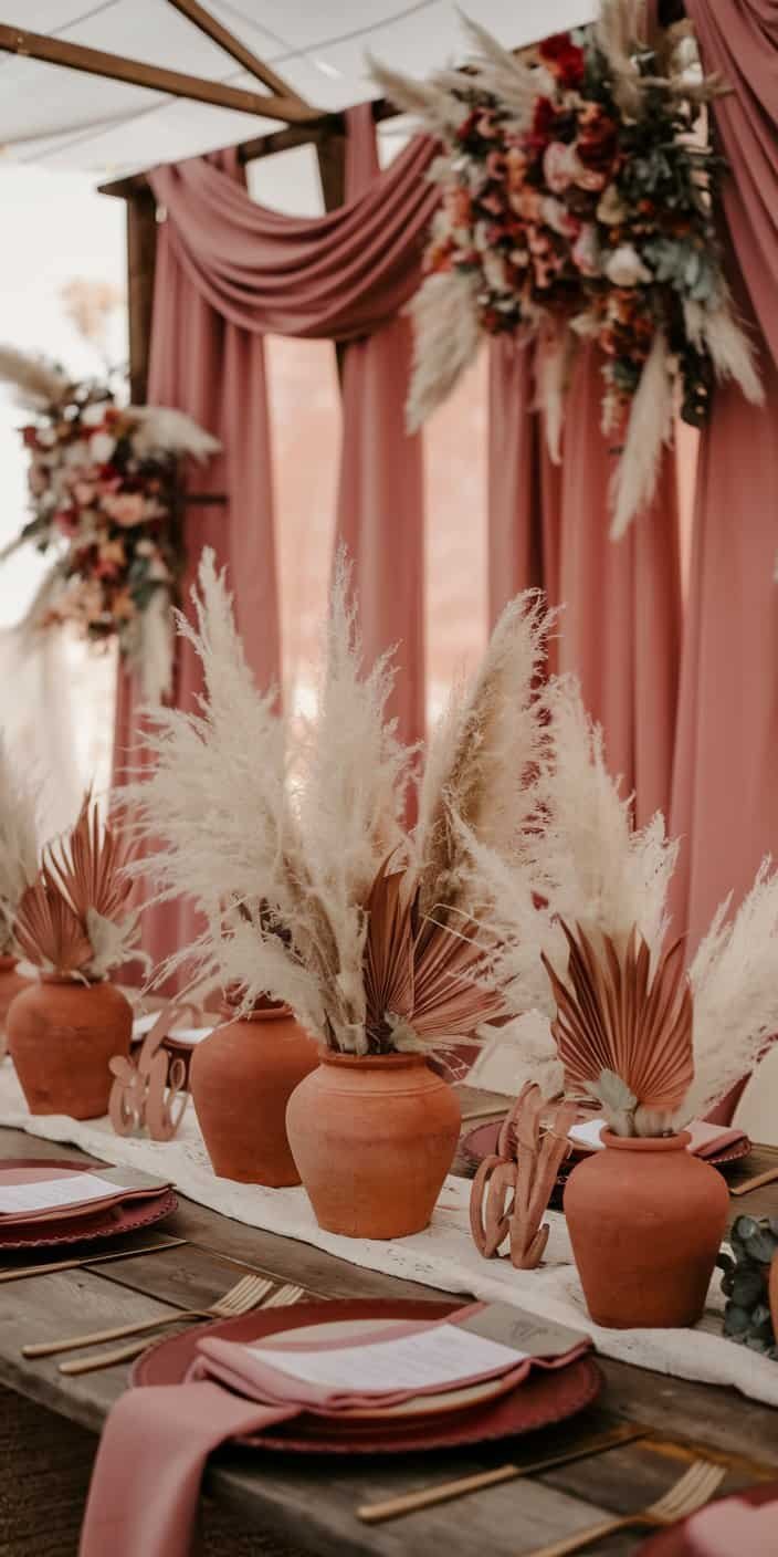
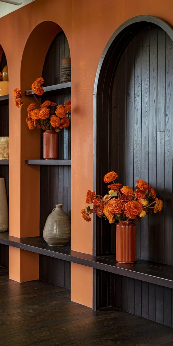
2. Terracotta and Dusty Rose
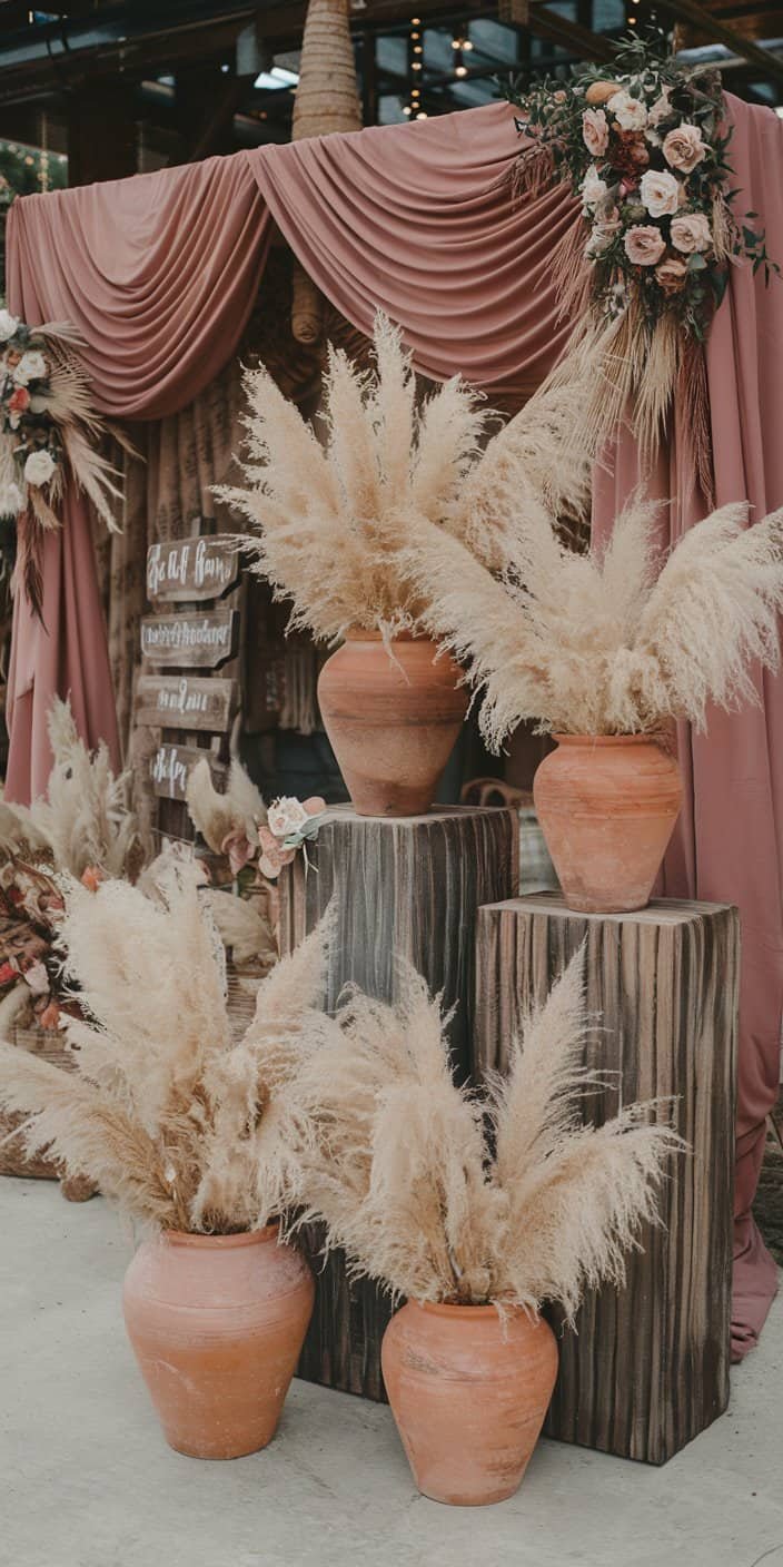
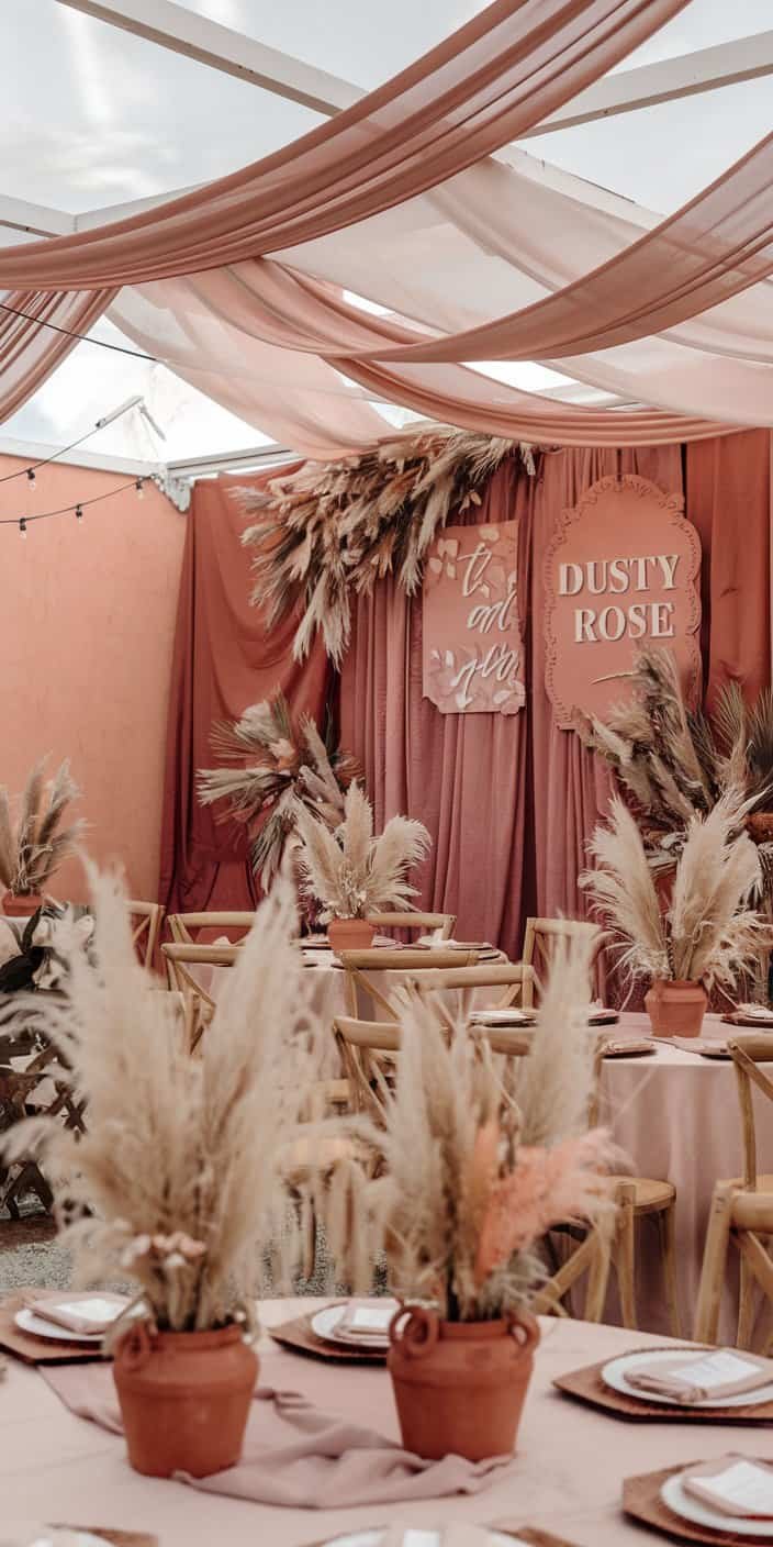
If you like the warmth of natural clay with a touch of romantic pink, terracotta and dusty rose may suit you perfectly. This pairing exudes a bohemian spirit, making it a great choice for desert or beachside ceremonies. You might use terracotta pots as centerpieces filled with pampas grass, then incorporate dusty rose into your drapery or signage.
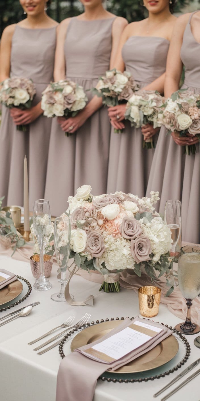
3. Taupe and Champagne
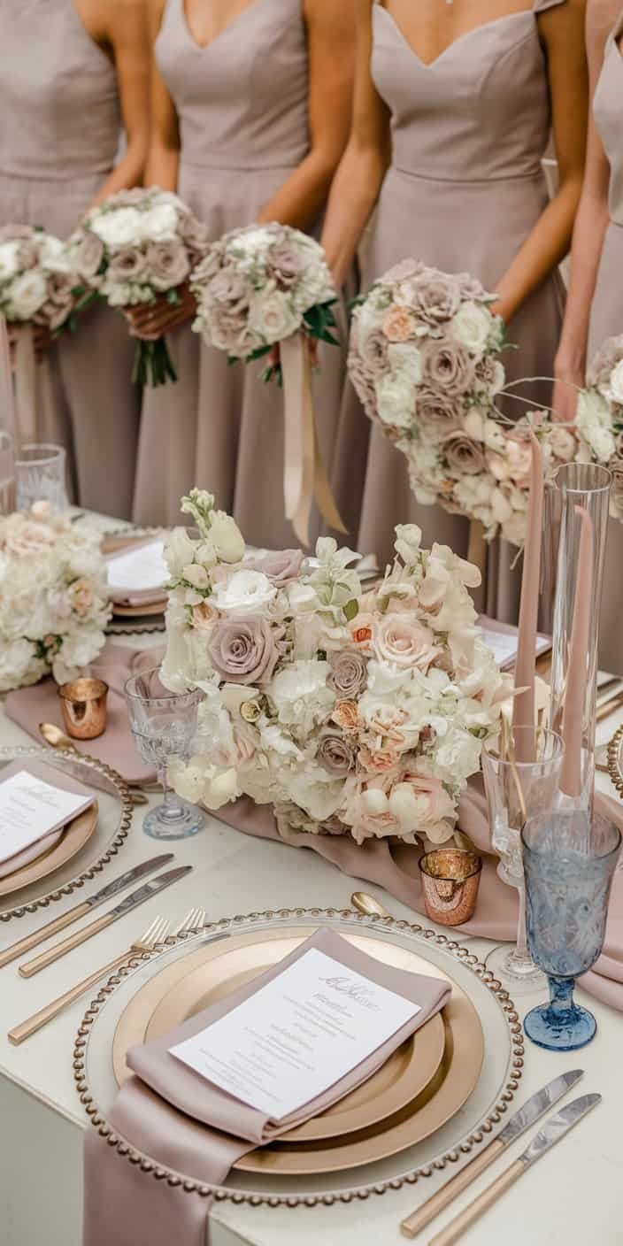
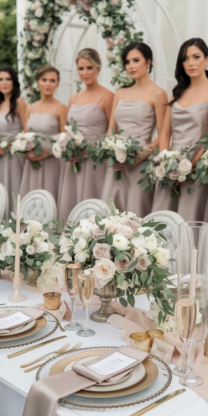
For those seeking an elegant, refined vibe, taupe and champagne step in gracefully. Taupe’s neutral undertone pairs perfectly with the delicate shimmer of champagne. This palette can infuse your space with a touch of glamour—consider bridesmaid gowns in taupe and table settings accented with champagne runners or metallic details.
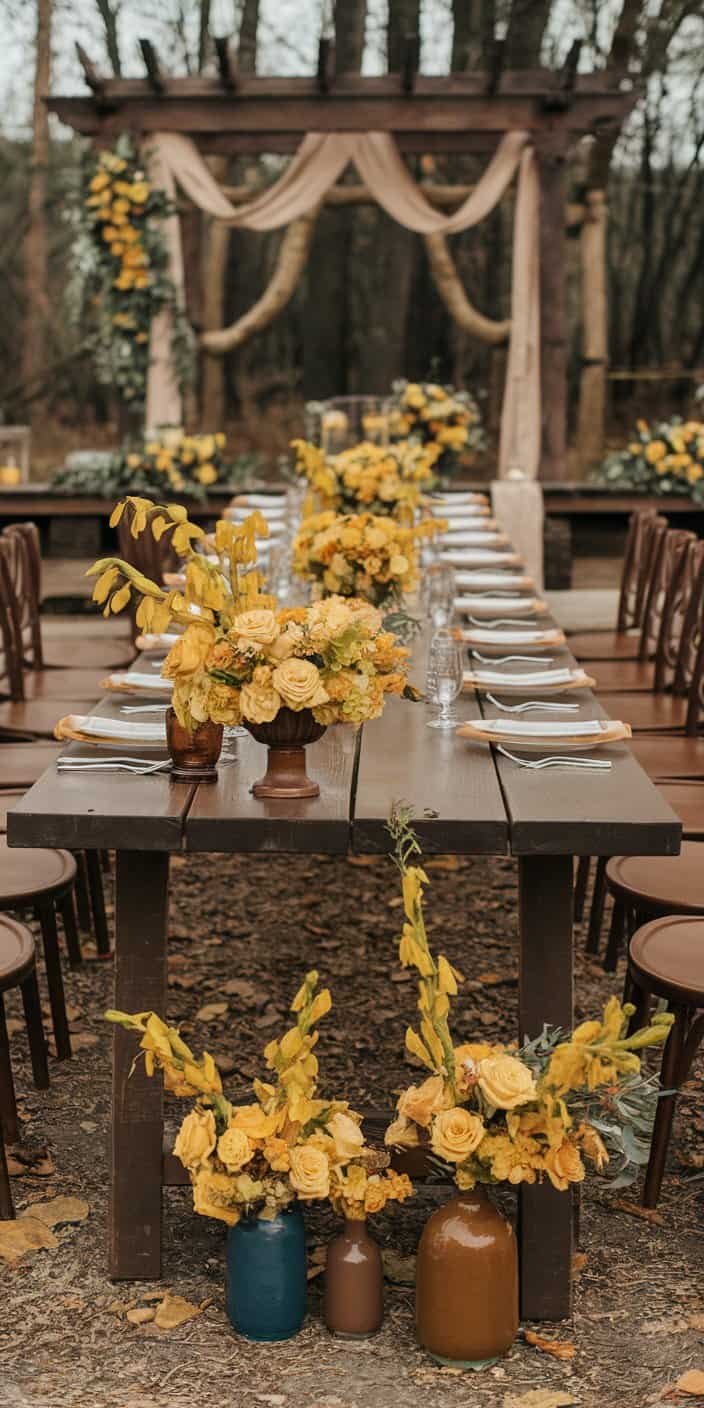
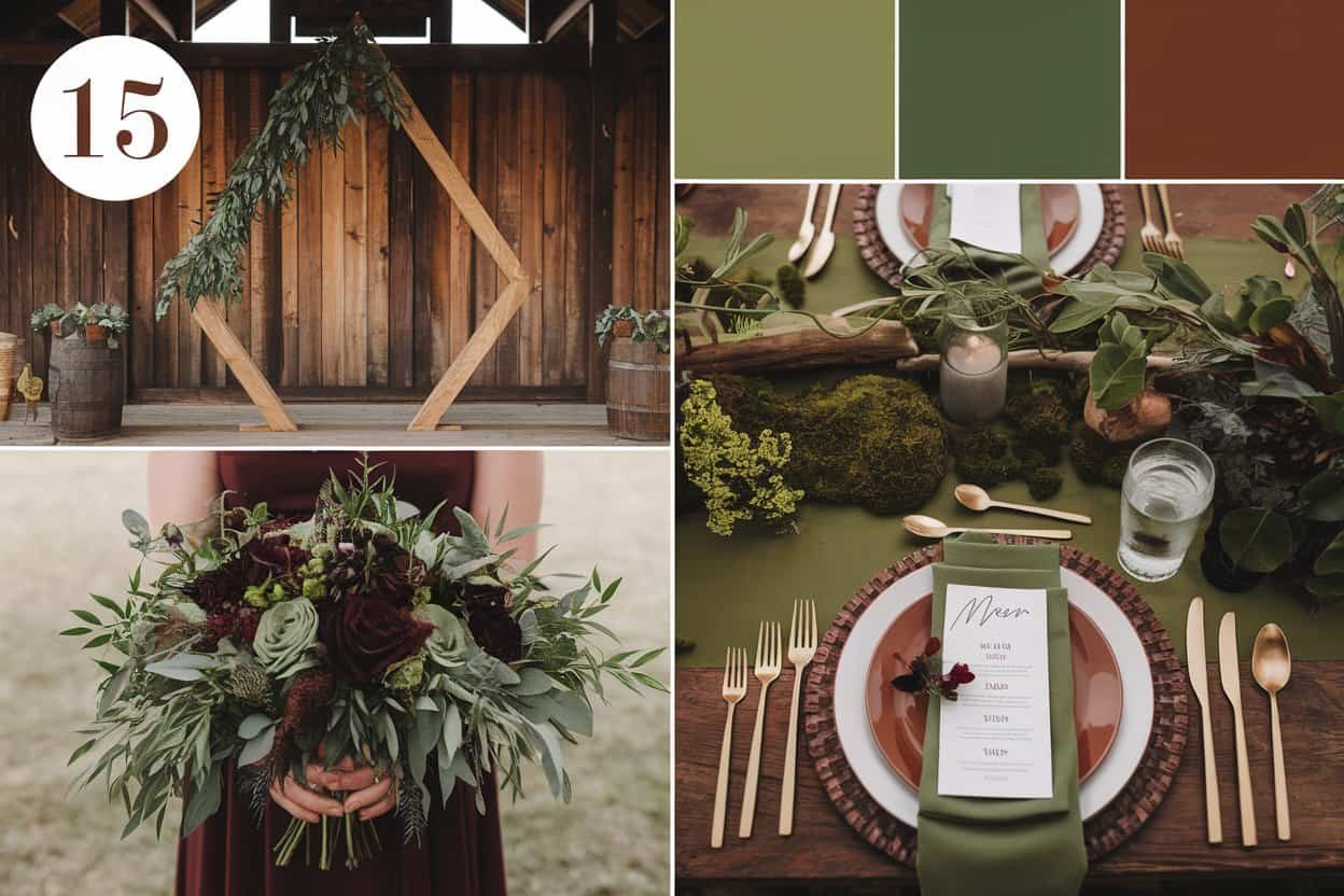
4. Mustard Yellow and Chocolate Brown

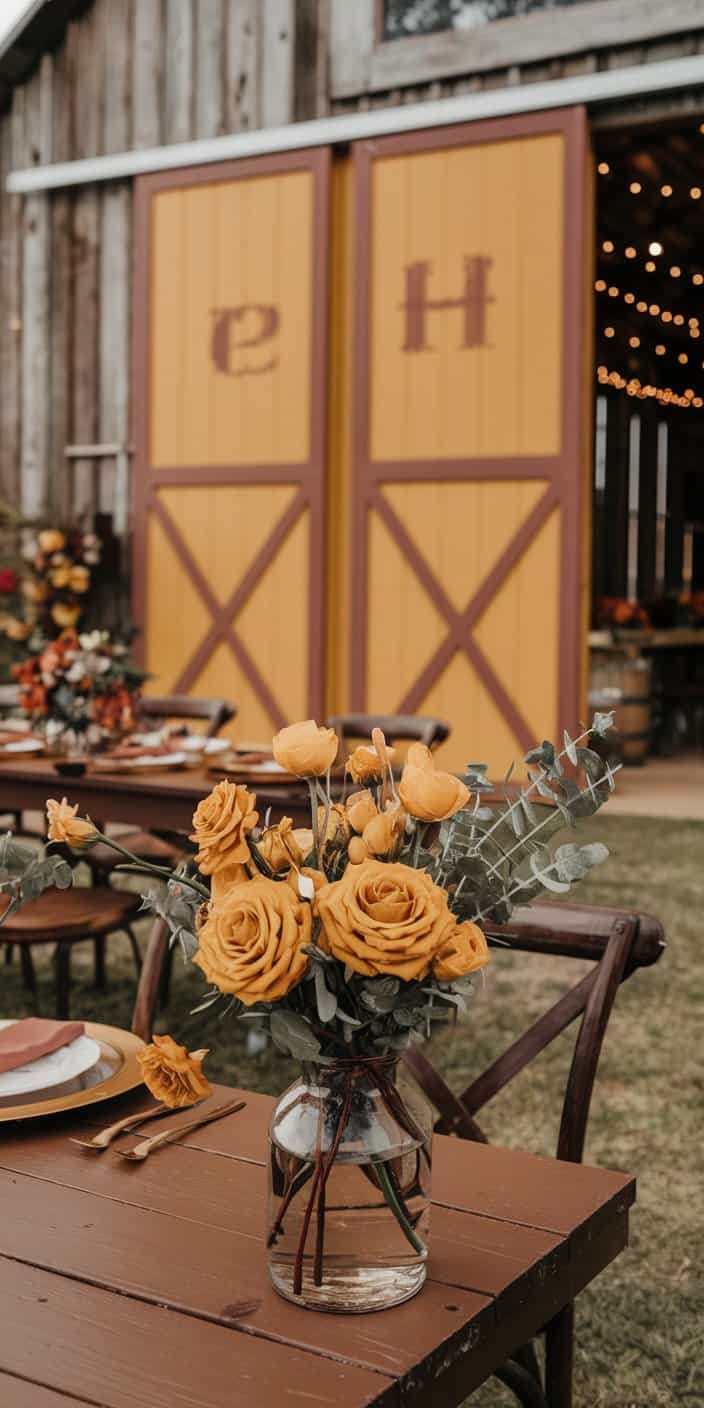
Some color enthusiasts might hesitate at pairing mustard with chocolate brown, but it creates a wonderfully inviting scene, especially for a rustic or autumnal wedding. Mustard supplies a pop of vibrancy, while brown keeps the palette grounded. You can incorporate these hues in various ways, like earthy floral arrangements or table signs painted in mustard with chocolate lettering.
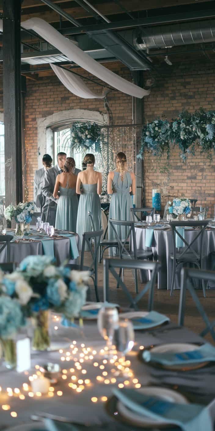
5. Dusty Blue and Gray
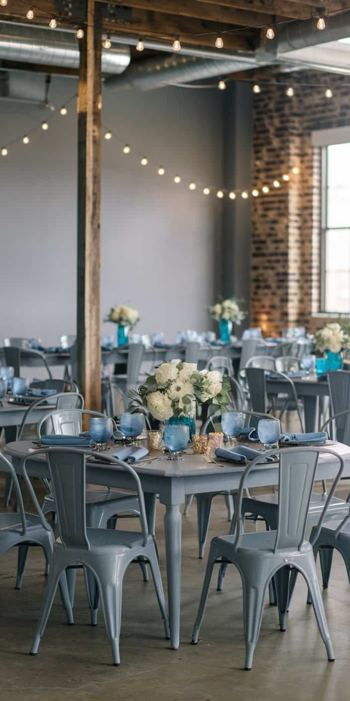
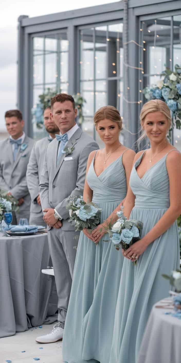
Dusty blue meets gray for a cool, refined pairing that works well in many seasons. You’ll see it shine in breezy outdoor ceremonies by the sea or sophisticated industrial lofts. Gray suits for the groomsmen, dusty blue dresses for the bridesmaids, and a combination of both colors in your floral selection can create an eye-catching harmony.
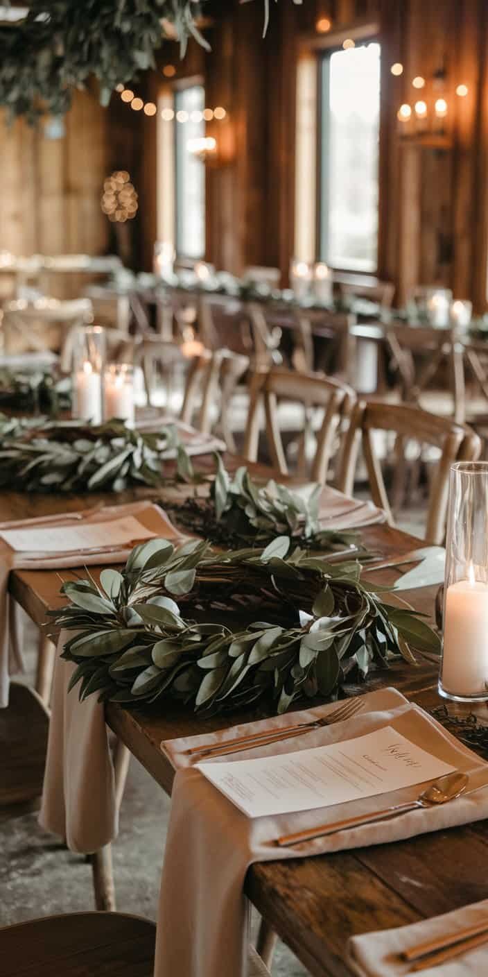
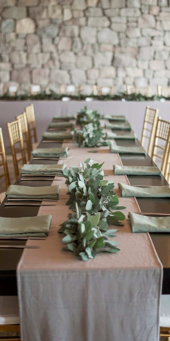
6. Olive Green and Warm Beige
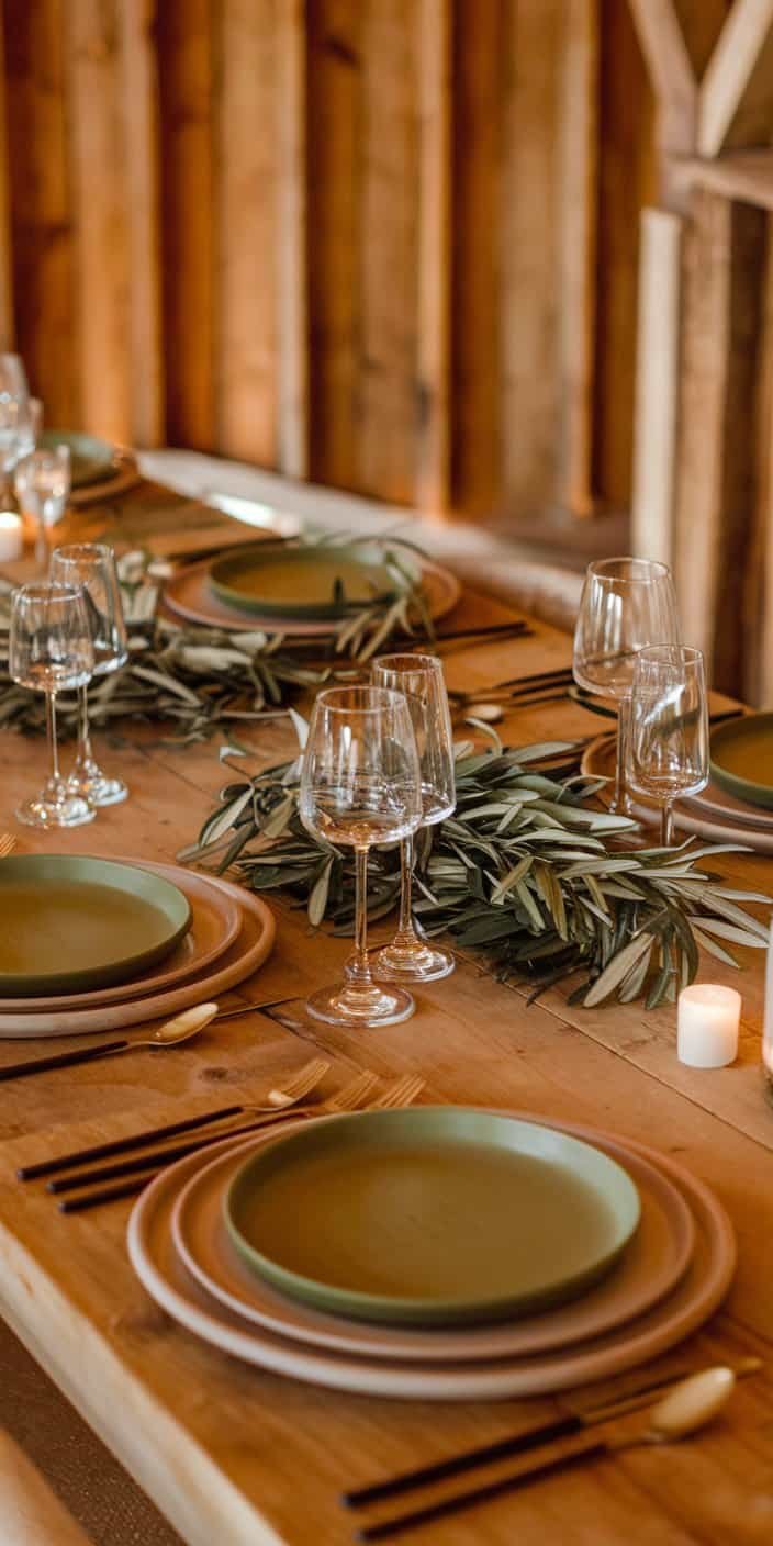
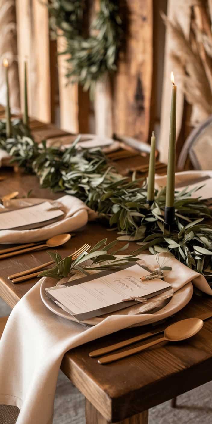
Olive green exudes natural richness, while warm beige provides a soft, neutral contrast. You’ll often see olive used in foliage or bridesmaid attire, and beige can anchor your table settings or invitations. This combination feels homey, especially if you’re leaning toward a woodland ceremony or a venue filled with wooden accents.
7. Mocha and Cream
Mocha and cream evoke a comforting atmosphere—think about the same feeling you get when sipping a latte in a cozy café. This palette tends to shine during cooler months, though you can certainly adapt it to any season with the right florals. Candles and string lights in a mocha and cream setting add a tranquil glow that might encourage guests to linger longer.
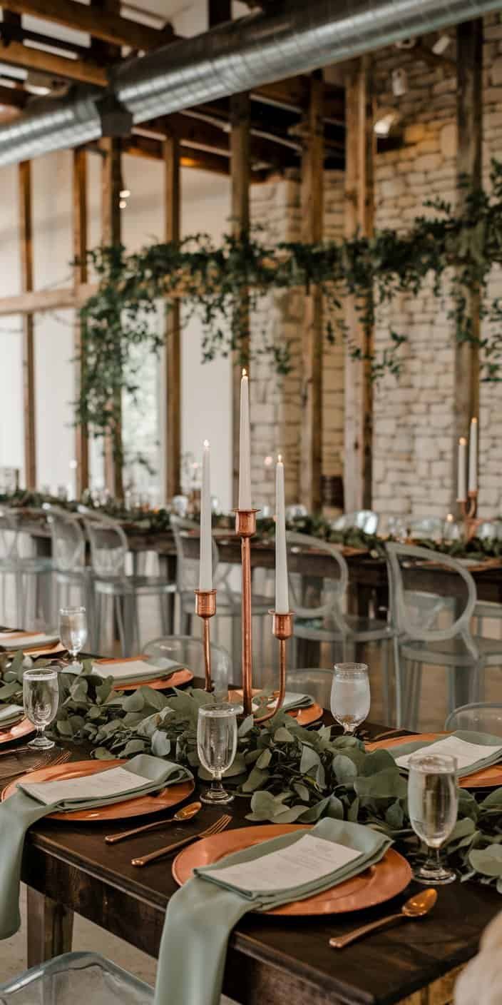
8. Copper and Sage
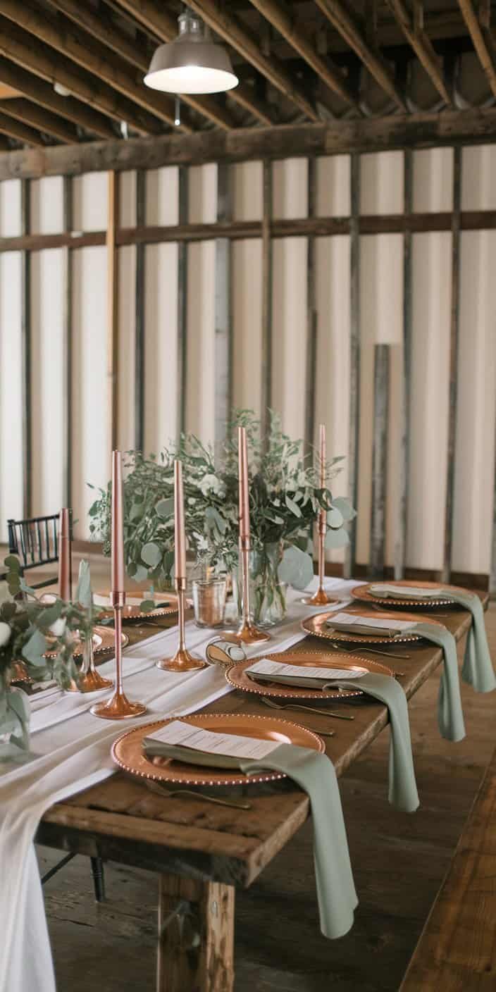

Copper’s metallic gleam pairs beautifully with the delicate nature of sage, striking a balance between luxury and rustic. You might showcase copper in candle holders, charger plates, or even small decorative touches around the venue. Meanwhile, sage remains present in the bridesmaid dresses, lush greenery, or accent pillows in lounge areas.
9. Burnt Orange and Espresso
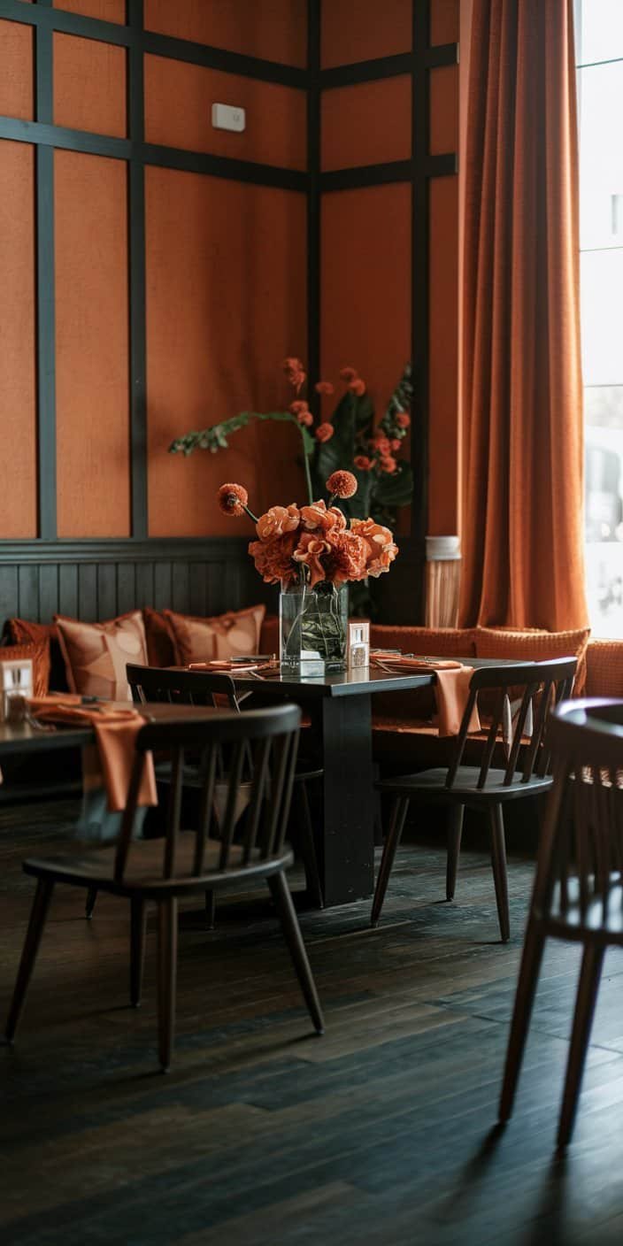
Vibrant burnt orange merges with a deep espresso brown for a statement that fits perfectly into fall ceremonies or woodsy backdrops. The boldness of burnt orange can shine in floral arches, while espresso details might appear in your seating arrangement or wedding signage. If you adore an autumn-inspired wedding, this duo is worth exploring.

10. Blush Pink and Khaki
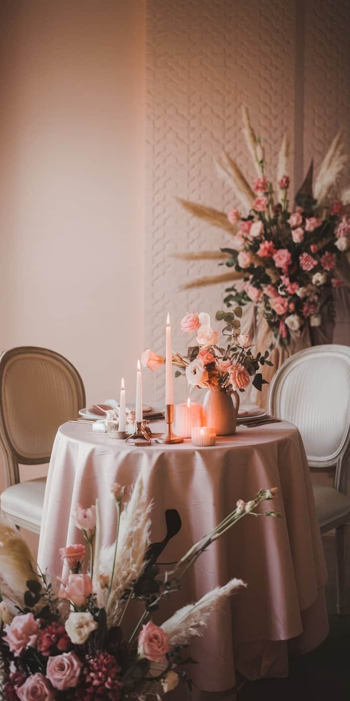
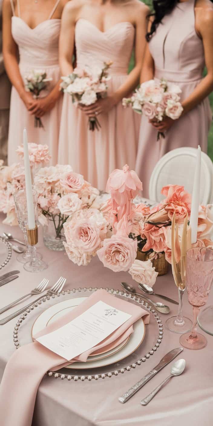
Blush pink offers a gentle sweetness, and khaki brings a neutral foundation to keep the overall look balanced. Because these two shades are relatively soft, you can layer them without making your decor look overwhelming. Consider blush table runners, khaki invitations, and maybe touches of gold or silver for extra sparkle.

11. Rust and Nude
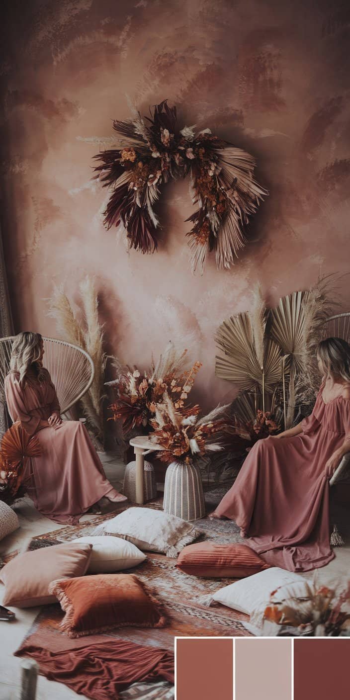

If you’re drawn to a vintage or bohemian feel, rust and nude is a pairing that stands out. Rust leans into a slightly reddish-brown shade, and nude steps in to mellow out the overall combination. You could imagine bridesmaid dresses in rust, dried floral wreaths with nude elements, and perhaps a lounge area decked in cozy pillows that mirror this palette.

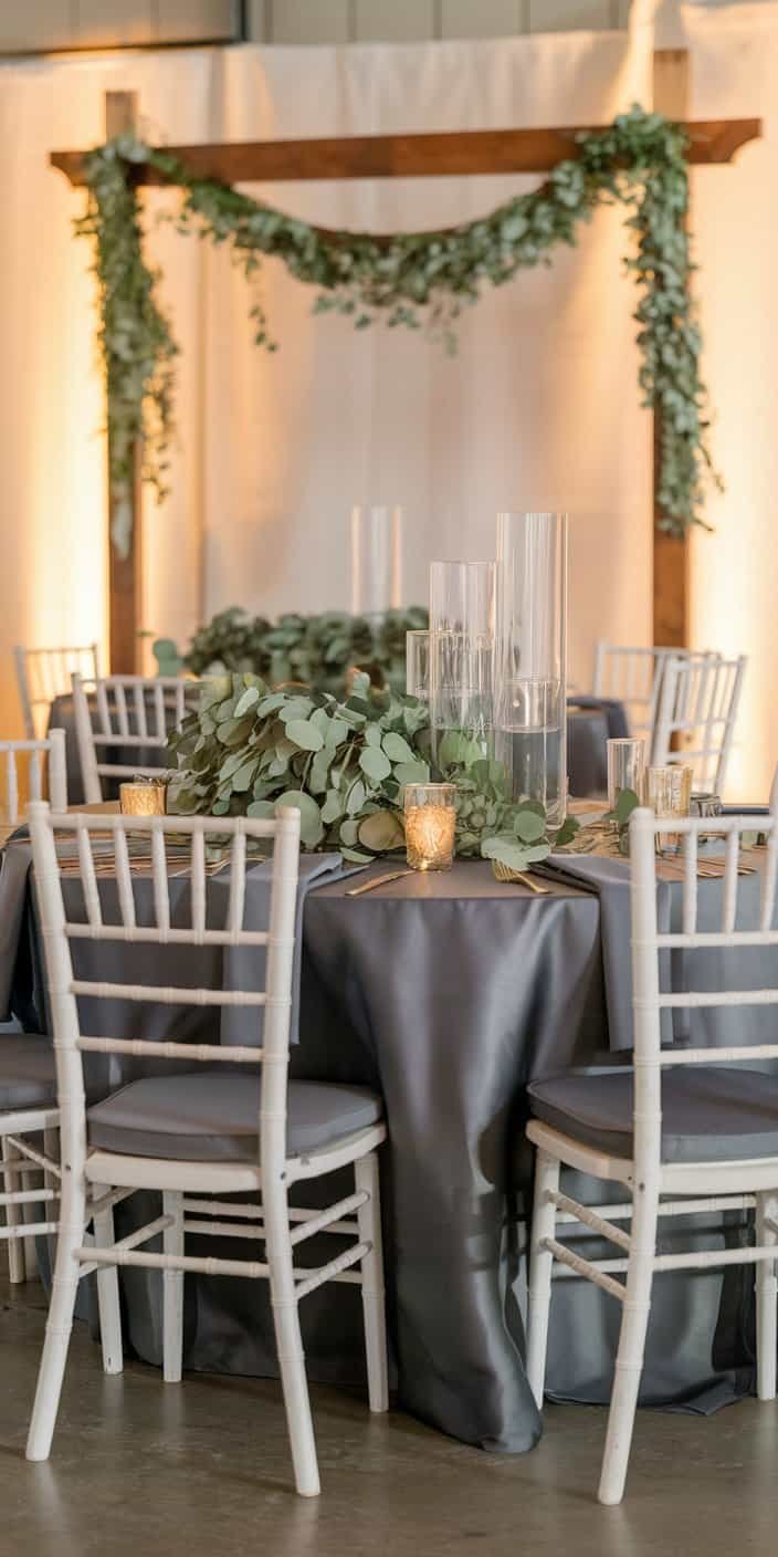
12. Charcoal and Eucalyptus Green

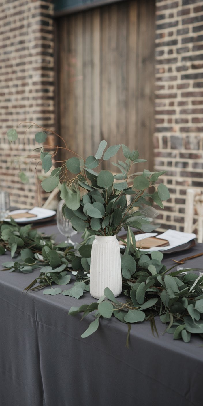
Charcoal offers a sleek, modern flair, while eucalyptus green introduces a calming, botanical hint. You might position charcoal in your tablecloths and stationery and let eucalyptus thread through your centerpieces or wearable florals. This blend feels particularly fitting for couples who appreciate contemporary design but still want a nod to nature’s bounty.

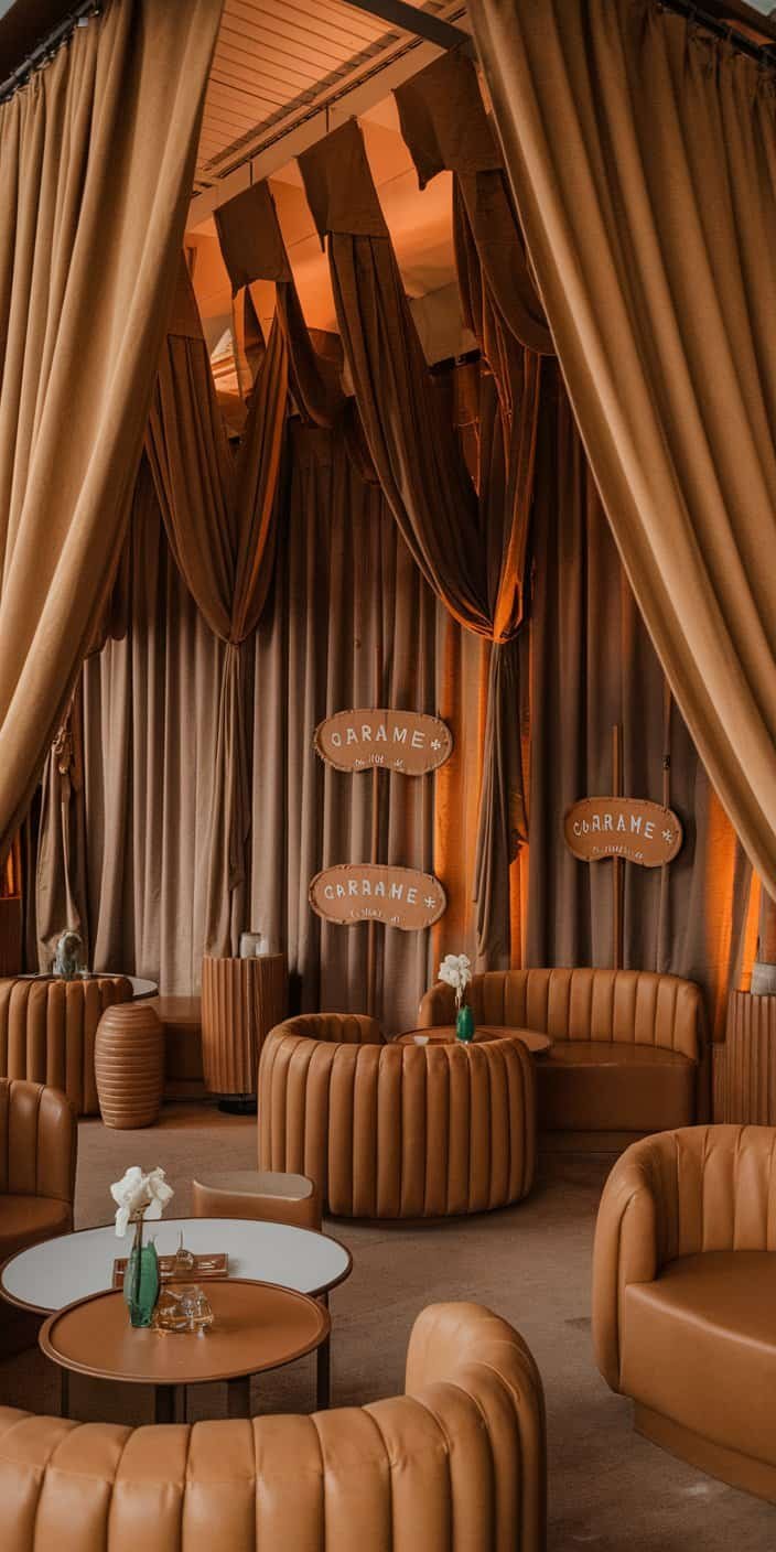
13. Caramel and Wheat
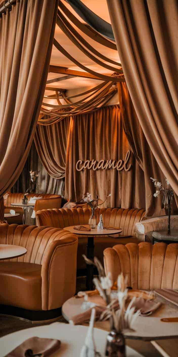
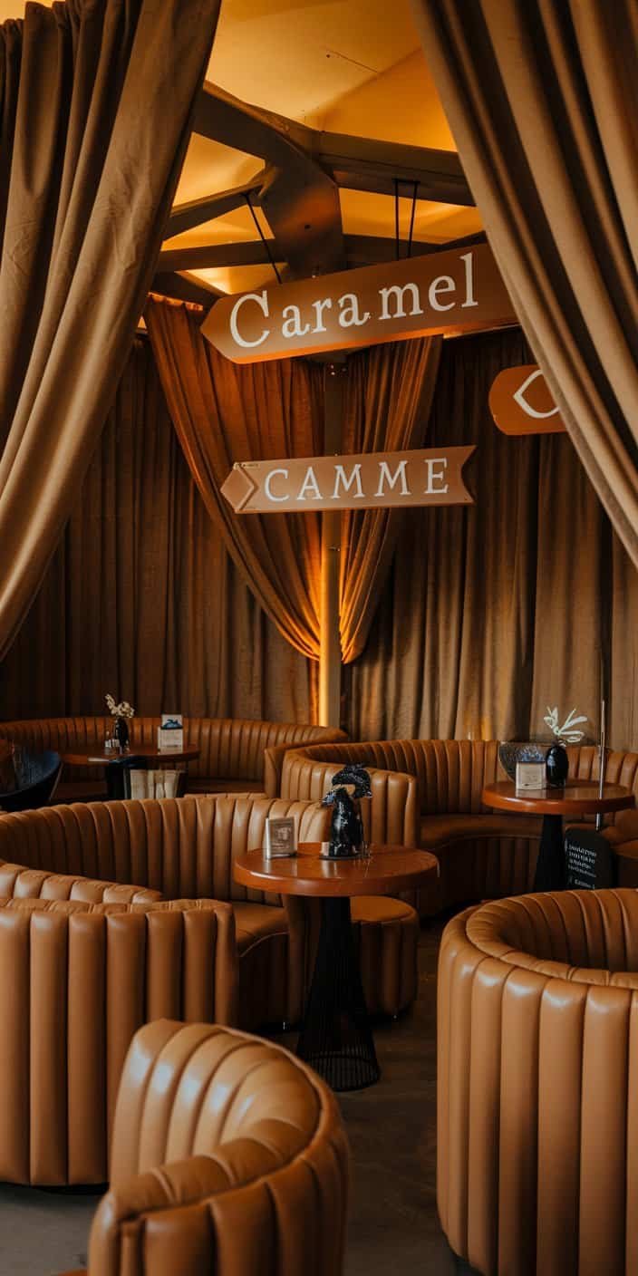
Caramel and wheat come together for an understated, comforting look. You might incorporate these hues into baskets, signage, or even as accent colors in your sweetheart table arrangement. This pairing also plays nicely with draped fabrics, leading to a soothing visual effect that might remind you of golden fields in late summer.

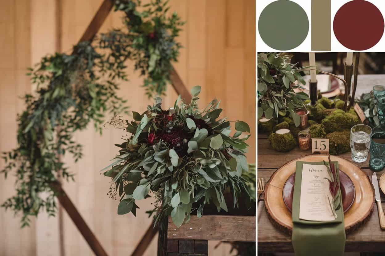
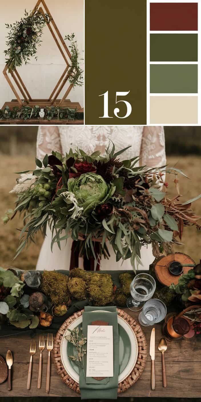
14. Sage, Stone Gray, and Gold


Craving a trio instead of a duo? Sage, stone gray, and gold might be your answer. Sage supplies the gentle green hue, stone gray anchors everything with a cool neutral base, and gold injects a bit of shine. This three-color palette can pop up across multiple elements: gold chairs, stone-gray table runners, and sage accents on your escort cards.

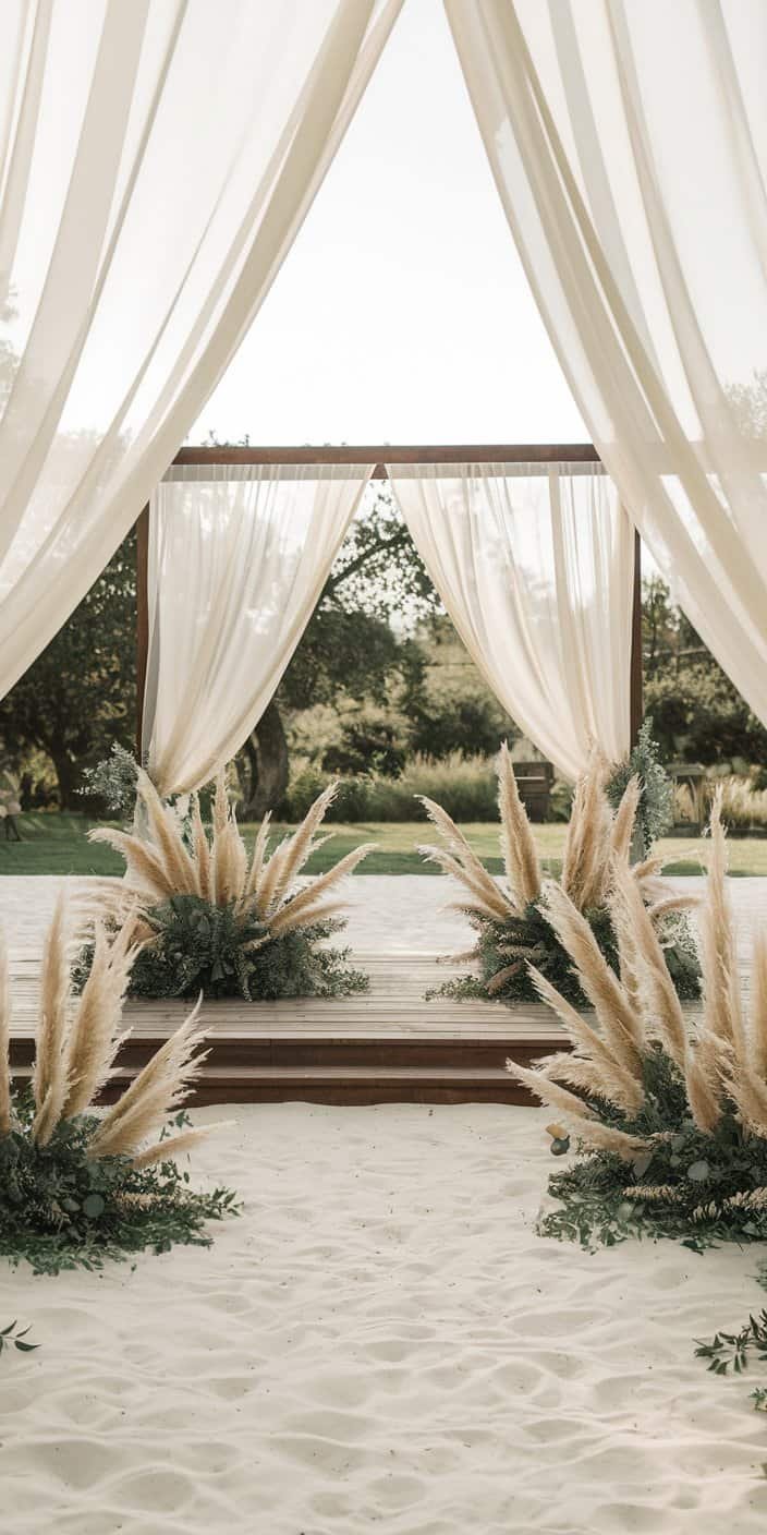
15. Ivory, Sand, and Dusty Olive
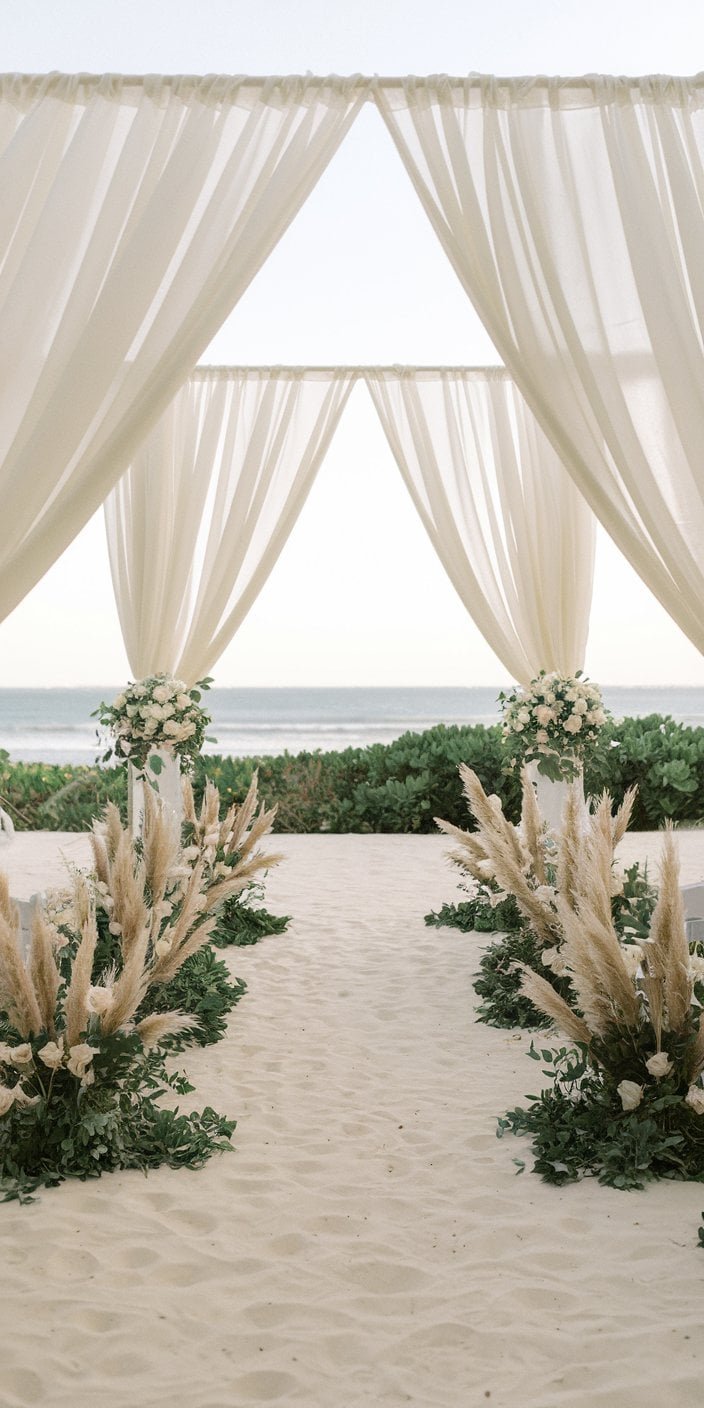
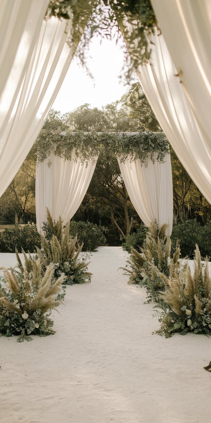
Those who favor an airy, beachy vibe might find themselves drawn to ivory, sand, and dusty olive. These tones work beautifully for an outdoor wedding by the sea, although you’re not limited to a shoreline setting. Use ivory for the main backdrop, sand for the subtle accent pieces, and dusty olive to emphasize natural greenery in bouquets or arches. 10 Beach Wedding Guest Dresses Perfect for Sun
Color Palette “Recipe” Table
Below is a quick reference chart for combining these tones. Think of these percentages as guidelines, not strict rules. If you prefer more of one hue, feel free to shift the ratios until you find your ideal combination.
| Palette | Colors (Hex Codes) | Suggested Ratio | Usage Tips |
|---|---|---|---|
| Sage + Ivory | #A0AD8F (Sage), #FFFFF0 (Ivory) | 60% Sage / 40% Ivory | Sage for bridesmaid dresses, ivory for floral & décor accents |
| Terracotta + Dusty Rose | #E2725B (Terracotta), #DCA9A9 (Dusty Rose) | 50% / 50% | Equal amounts across table decor, seating areas, and possibly attire |
| Taupe + Champagne | #B8A897 (Taupe), #F7E7CE (Champagne) | 70% / 30% | Heavier use of taupe for a neutral base; champagne for added sparkle |
| Mustard + Chocolate Brown | #D4A017 (Mustard), #4B2E2B (Chocolate) | 40% / 60% | Brown for main décor, mustard as a bright accent in signage or arrangements |
| Dusty Blue + Gray | #A8BFC9 (Dusty Blue), #808080 (Gray) | 50% / 50% | Balanced usage; consider dyed linens and gray suits paired with dusty blue pocket squares |
| Olive Green + Warm Beige | #3B3C36 (Olive), #EED9C4 (Beige) | 60% / 40% | Emphasize olive in greenery, with beige in tablecloths and bridal party accessories |
| Mocha + Cream | #806355 (Mocha), #FFFDD0 (Cream) | 55% / 45% | Mocha in drapery or accent furniture, cream in candles and stationery |
| Copper + Sage | #B87333 (Copper), #98A886 (Sage) | 40% / 60% | Use copper chargers and vases; sage becomes the primary color for attire or table runners |
| Burnt Orange + Espresso | #CC5500 (Burnt Orange), #3B2F2F (Espresso) | 50% / 50% | Equally distribute for a striking fall palette; consider dried florals in burnt orange, espresso signage |
| Blush Pink + Khaki | #F2C2C2 (Blush), #C3B091 (Khaki) | 60% / 40% | Feature pink in florals, khaki in invitations or signage |
| Rust + Nude | #B7410E (Rust), #F5F5DC (Nude) | 50% / 50% | Split equally to highlight warm undertones in décor, bridal party looks, and centerpieces |
| Charcoal + Eucalyptus Green | #36454F (Charcoal), #9FAE9B (Eucalyptus) | 70% / 30% | Charcoal for a modern vibe, eucalyptus for subtle greenery in florals and accessories |
| Caramel + Wheat | #C68E17 (Caramel), #F5DEB3 (Wheat) | 60% / 40% | Emphasize caramel in drapes or ribbons, wheat for stationery or table runners |
| Sage + Stone + Gold | #9C9F84 (Sage), #8B8C7A (Stone), #D4AF37 (Gold) | 40% Sage / 40% Stone / 20% Gold | Gold cutlery or candle holders, stone background details, sage in florals |
| Ivory + Sand + Dusty Olive | #FFFFF0 (Ivory), #F4A460 (Sand), #8A9977 (Olive) | 50% Ivory / 30% Sand / 20% Olive | Ivory as the main tone, sand in accent pieces, dusty olive for greenery |
Styling Tips and Implementation
Selecting the perfect palette is just the start. The next step involves blending these shades into all facets of your wedding design, from décor to attire.
Ceremony and Reception Decor
- Floral Arrangements: Pair your chosen palette with flowers and greenery that echo the dominant hues. If you’ve chosen copper and sage, for instance, bring in sage leaves or eucalyptus for centerpieces and bouquets, then add copper vessels or ribbons for a glimmering accent.
- Linens and Drapes: Tablecloths, napkins, and backdrops offer ample canvas for introducing color. A dusty blue tablecloth set against gray chargers, for example, looks refined and cohesive.
- Lighting: Subtle lighting can make or break the overall ambiance. String lights, lanterns, and candles in neutral shades or metallic tones can amplify the color scheme without clashing.
Attire and Accessories
- Bridal Party: It helps to keep your palette in mind when choosing bridesmaid dresses, groomsmen ties, or even the groom’s suit. If you’re leaning toward sage and ivory, sage dresses or suits pair beautifully with ivory bouquets and pocket squares.
- Groom and Groomsmen: Don’t underestimate the impact of well-chosen accessories. Ties, boutonnieres, or socks in the primary color can bring a sense of unity to the wedding party.
- Guest Dress Code: Though you wouldn’t typically require guests to adhere strictly to your wedding colors, you can hint at a dress code that suggests neutrals or earthy shades. This approach might organically complement your event’s setting.
Stationery and Invites
- Colorful Envelopes: If you’re inclined to give guests a sneak preview of your theme, incorporate your palette into the envelopes themselves. A burnt orange envelope, for example, could become a playful introduction to a burnt orange and espresso wedding.
- Fonts and Illustrations: The style of your typography can bring your palette to life. Minimalistic fonts in a warm taupe or gold foil could enhance that sense of elegant harmony.
- Save-the-Date Cards: Keep your brand consistent by using the same color ratios from the table above. A consistent theme across your stationery ties every piece of the puzzle together.
Conclusion
When you settle on Earth Tone Wedding Color Ideas and Palettes, you set the stage for a gathering that feels both timeless and intimate. These warm, nuanced hues connect with something fundamental in us, reminding us of sunlit afternoons, quiet forests, and peaceful coastlines. By weaving them through your event—from the invites you mail out to the final touches of your reception decor—you create a space that’s welcoming to everyone who steps inside.
Your wedding day should reflect your story, your style, and your connection. When you choose an earthy palette, you underscore the notion of growth, stability, and deep-rooted love. No matter which combination you select—whether it’s a refined taupe and champagne or a bold burnt orange and espresso—the result can communicate your personal identity in an artful way.
FAQ: Earth Tone Wedding Color Ideas and Palettes
- Can I mix multiple earth tone palettes in the same wedding?
You absolutely can. The key is to ensure all chosen tones harmonize with one another. You might introduce one set of colors for the bridal party and another for reception decor, as long as the result feels cohesive. - Which season is best for Earth Tone Wedding Color Ideas and Palettes?
Earthy shades can work in any season. Warmer combinations like terracotta and dusty rose might feel perfect for summer or fall, while palettes featuring gray or mocha can add a cozy feeling for winter. - How do I avoid making the overall look too monotonous?
The simplest approach is to play with varying depths or add metallic elements. For instance, if you have a mostly neutral scheme, try weaving in hints of copper, gold, or silver for extra dimension. - Should bridesmaid dresses match the decor exactly?
There’s no one-size-fits-all rule here. Matching is not mandatory. You can have the dresses in one of the main colors and employ the secondary shades in your bouquets, table settings, or even the groom’s ensemble. - What if I already have a favorite color that isn’t typically ‘earthy’?
You can still incorporate that color. Try pairing it with neutrals from your palette, letting it serve as a pop of brightness. This keeps your overall theme earthy while allowing your personal taste to shine.

Now that you’ve explored these Earth Tone Wedding Color Ideas and Palettes, it’s time to put your vision into action. Share your favorite combinations with your wedding planner or design team. If you’re handling the preparations yourself, start creating a mood board or gather color swatches so you can visualize how all the elements will come together. Invite friends and family to weigh in on which palettes feel most authentically you. By investing care and thought into your color scheme, you’ll craft a day that lingers in everyone’s memories—a heartfelt celebration rooted in warmth, harmony, and genuine connection.